One.nz
Report design
One.nz is a New Zealand-based provider of mobile, broadband, and business network services, committed to delivering innovative and reliable connectivity solutions.
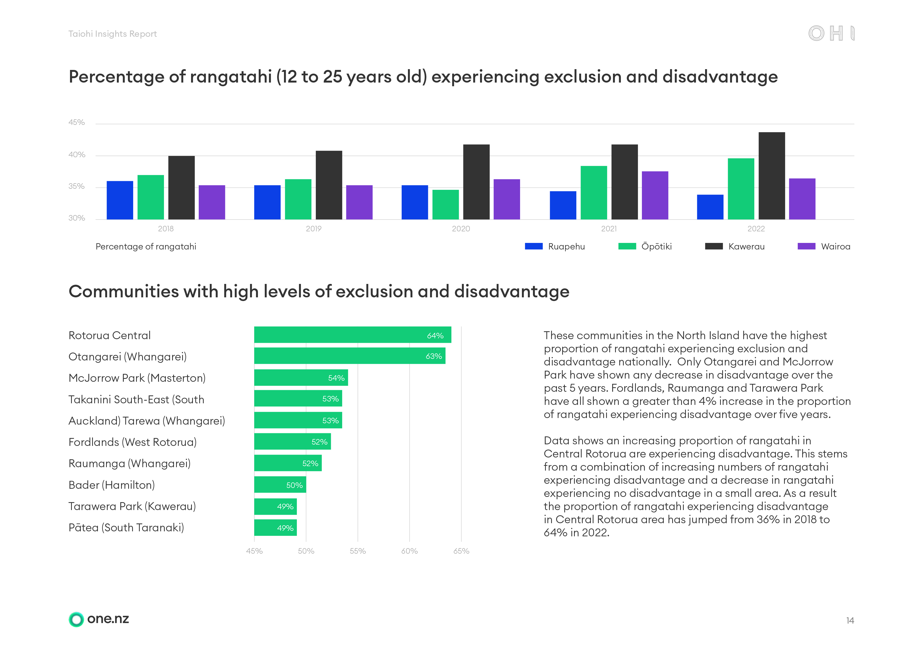
For the Taiohi Insights Report, the objective was to present the OHI Data Navigator within brand guidelines through a clear, functional layout that effectively communicates the core message, key findings, and achieved research goals.

Data visualisation
One.nz is a New Zealand-based provider of mobile, broadband, and business network services, committed to delivering innovative and reliable connectivity solutions.
For the Taiohi Insights Report, the objective was to present the OHI Data Navigator within brand guidelines through a clear, functional layout that effectively communicates the core message, key findings, and achieved research goals.



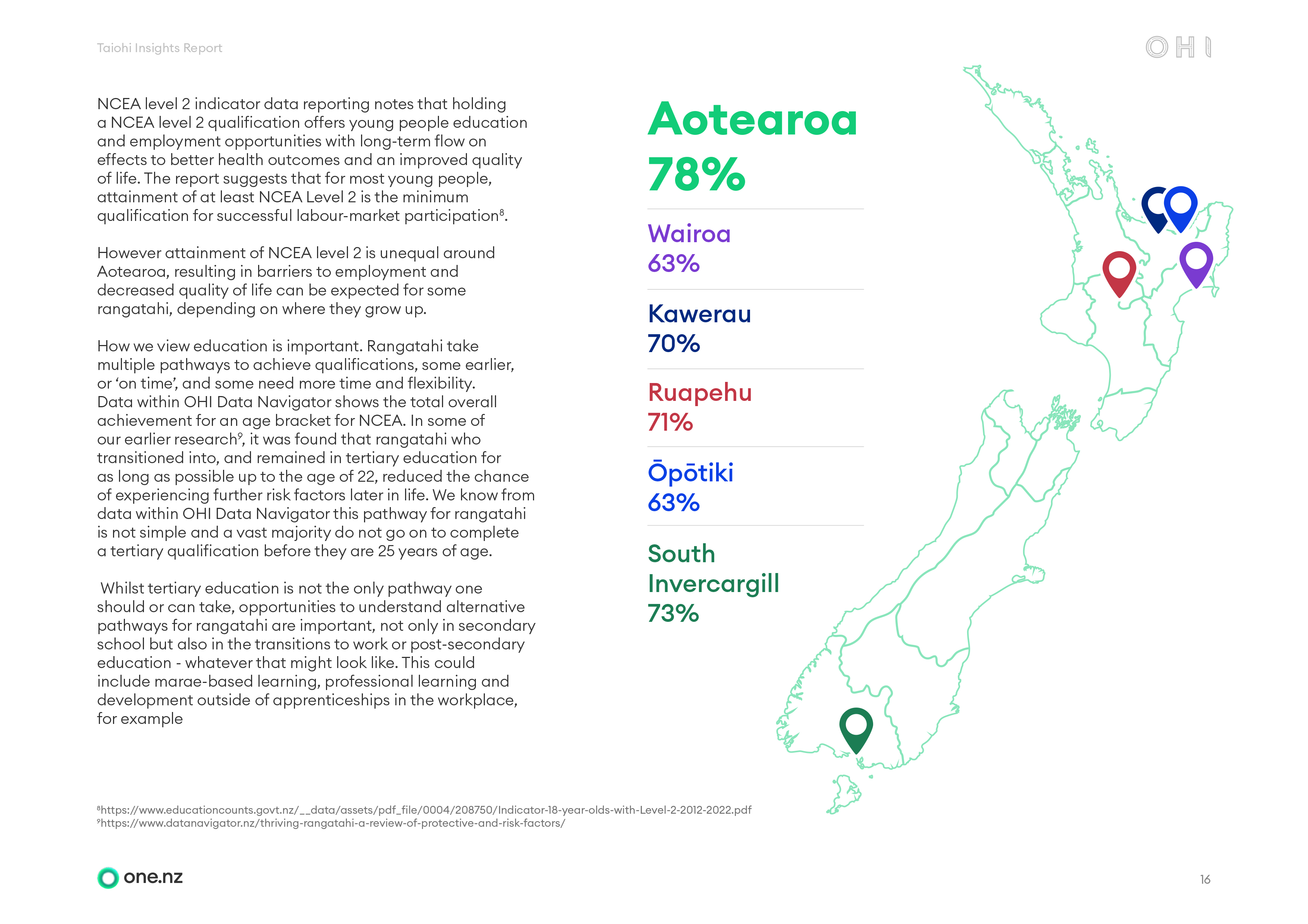
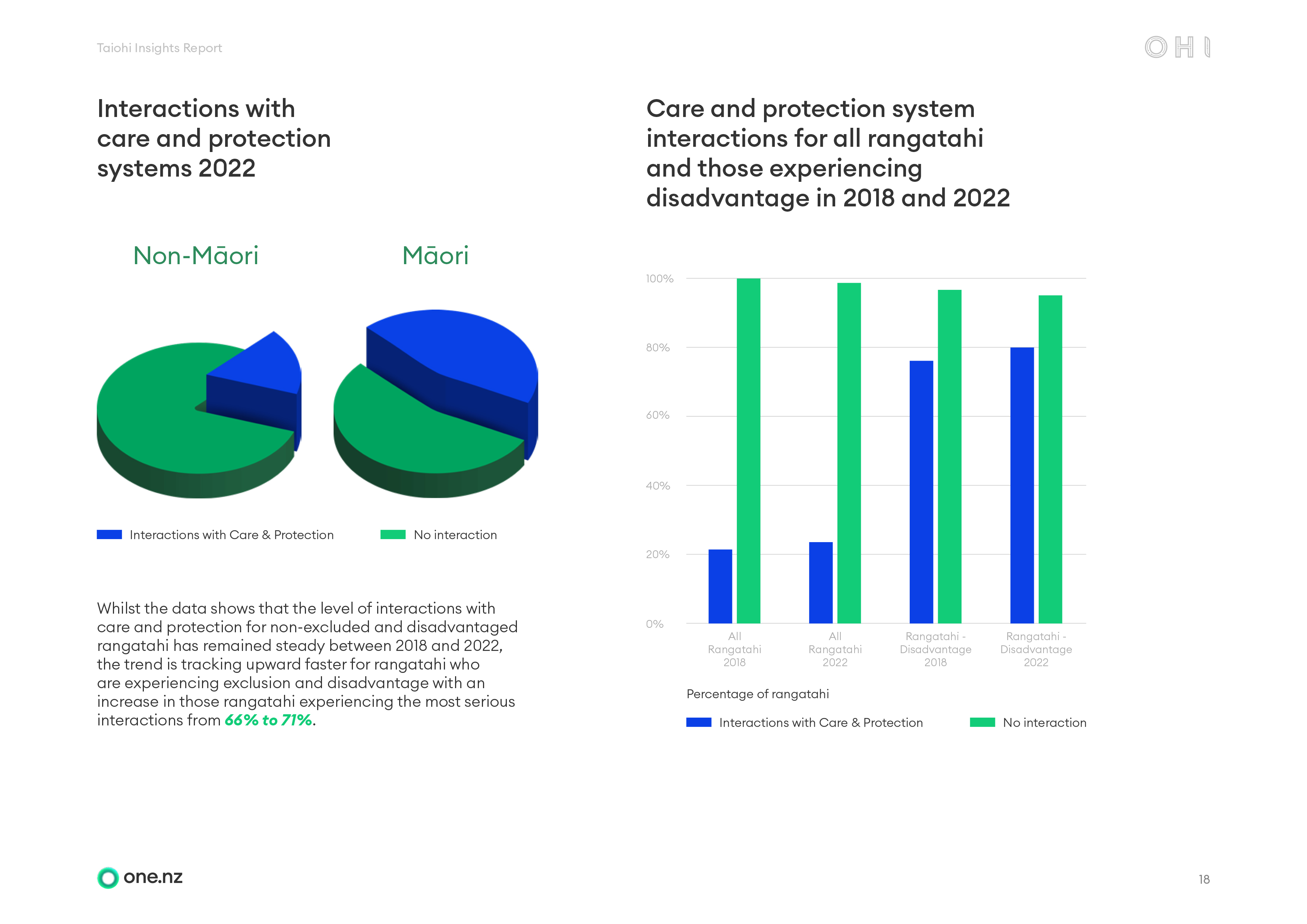
Layout design
This section of the report showcases the thoughtful presentation of research findings while maintaining a strong and consistent alignment with the overall brand tone, voice, and visual identity.
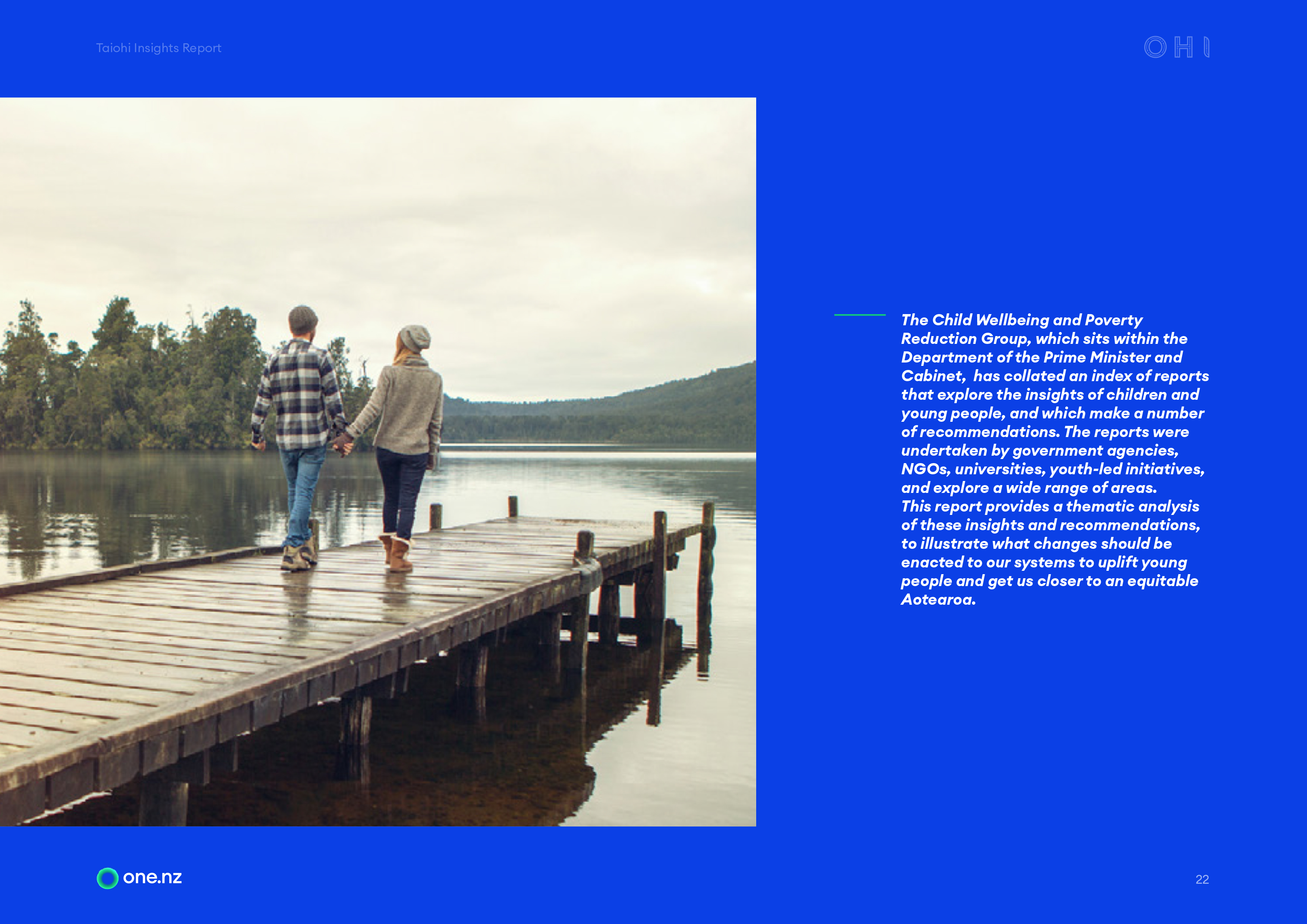
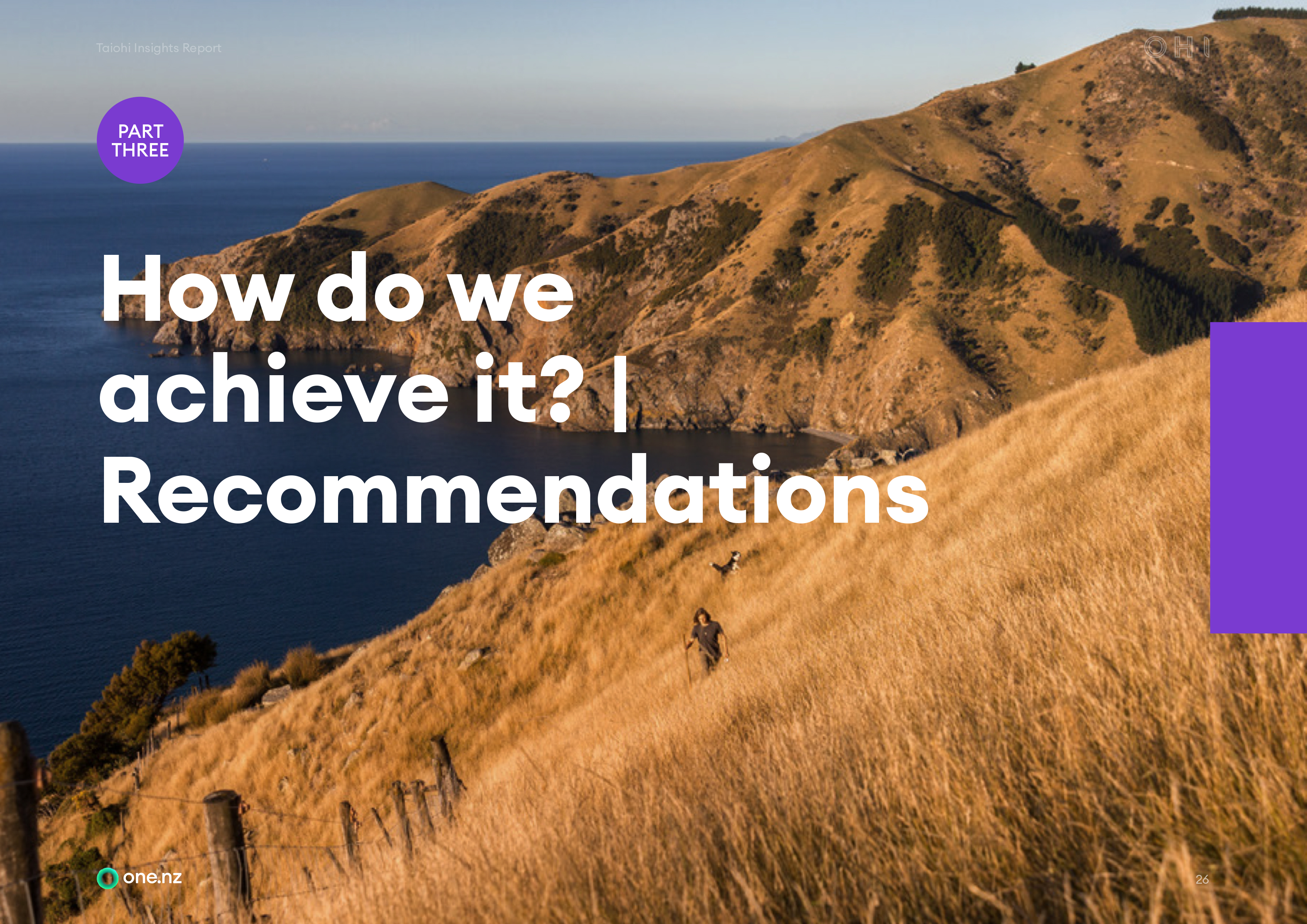
Although lighter in content volume compared to other sections, the pages were designed with an expressionist and ambient aesthetic, using a clean, minimalistic approach that enhances visual appeal and readability.



EcoVadis
Report design
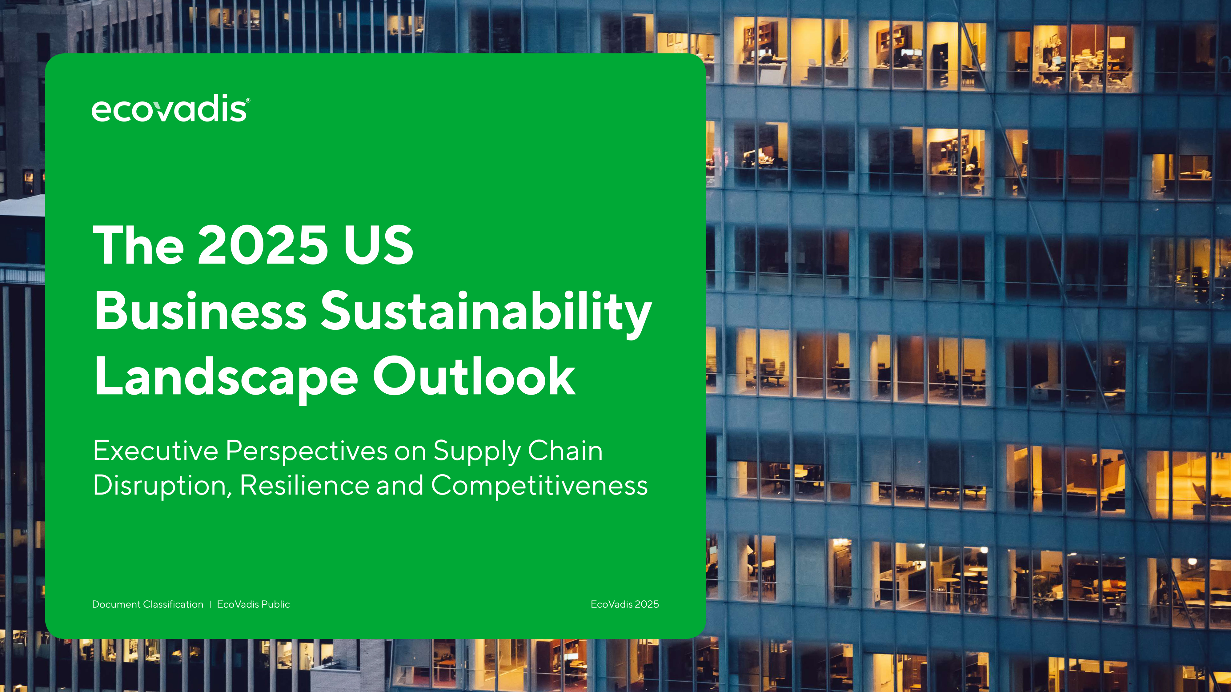
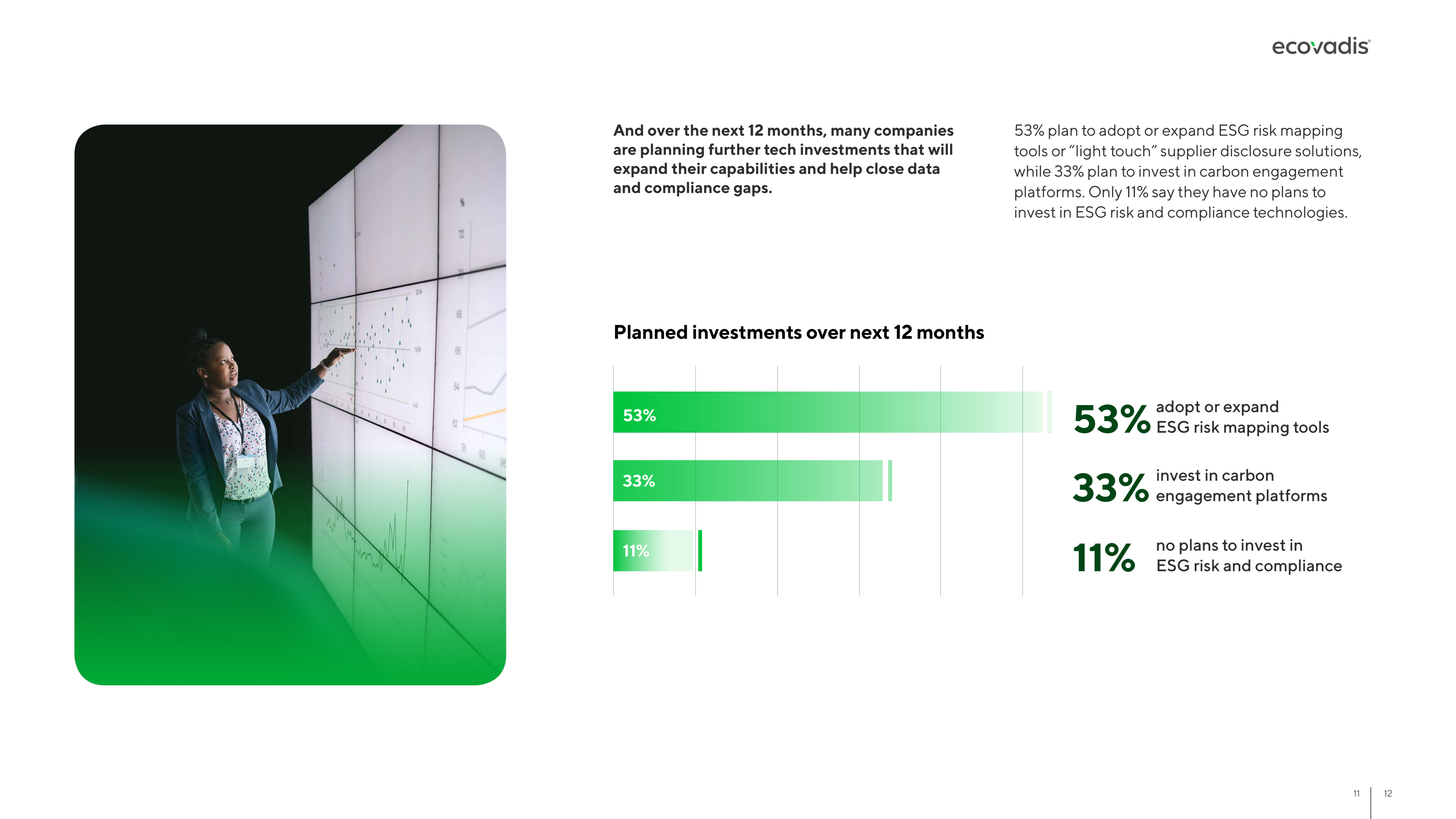
EcoVadis is a global leader in business sustainability ratings, helping companies assess and improve ESG performance across their supply chains. The 2025 US Business Sustainability Landscape Outlook, based on a survey of 400 executives, explores how corporate leaders are navigating regulatory uncertainty, supply chain risk, and the growing gap between quiet sustainability investment and public communication.
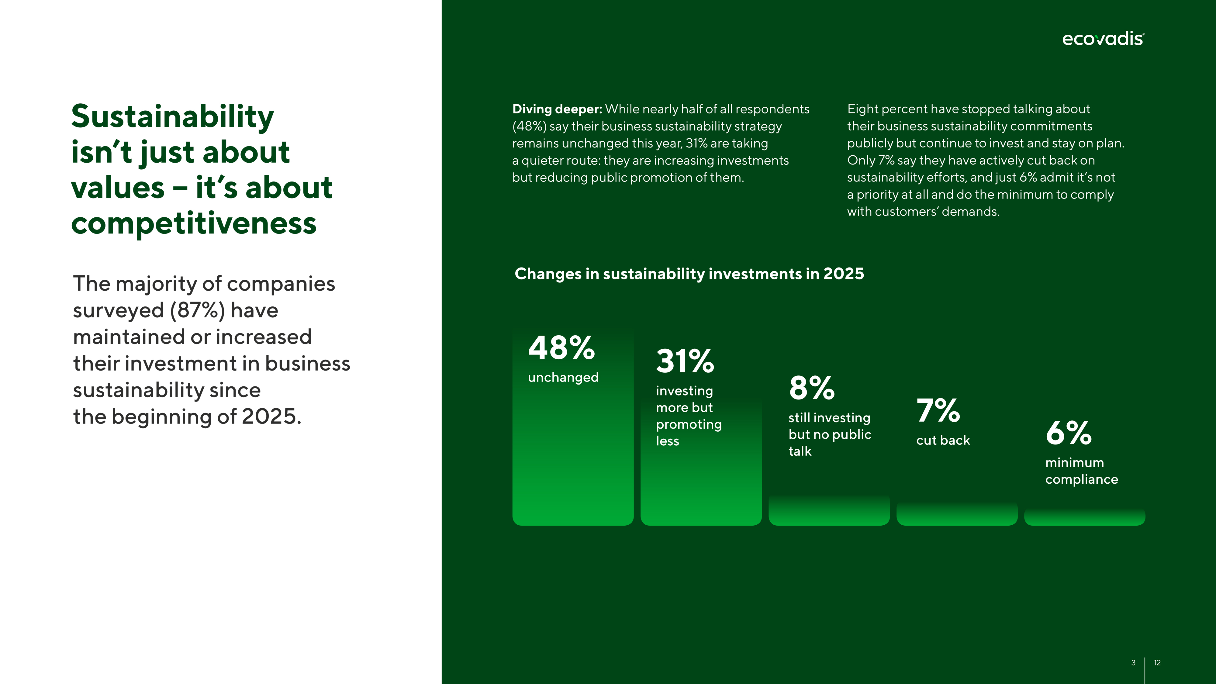
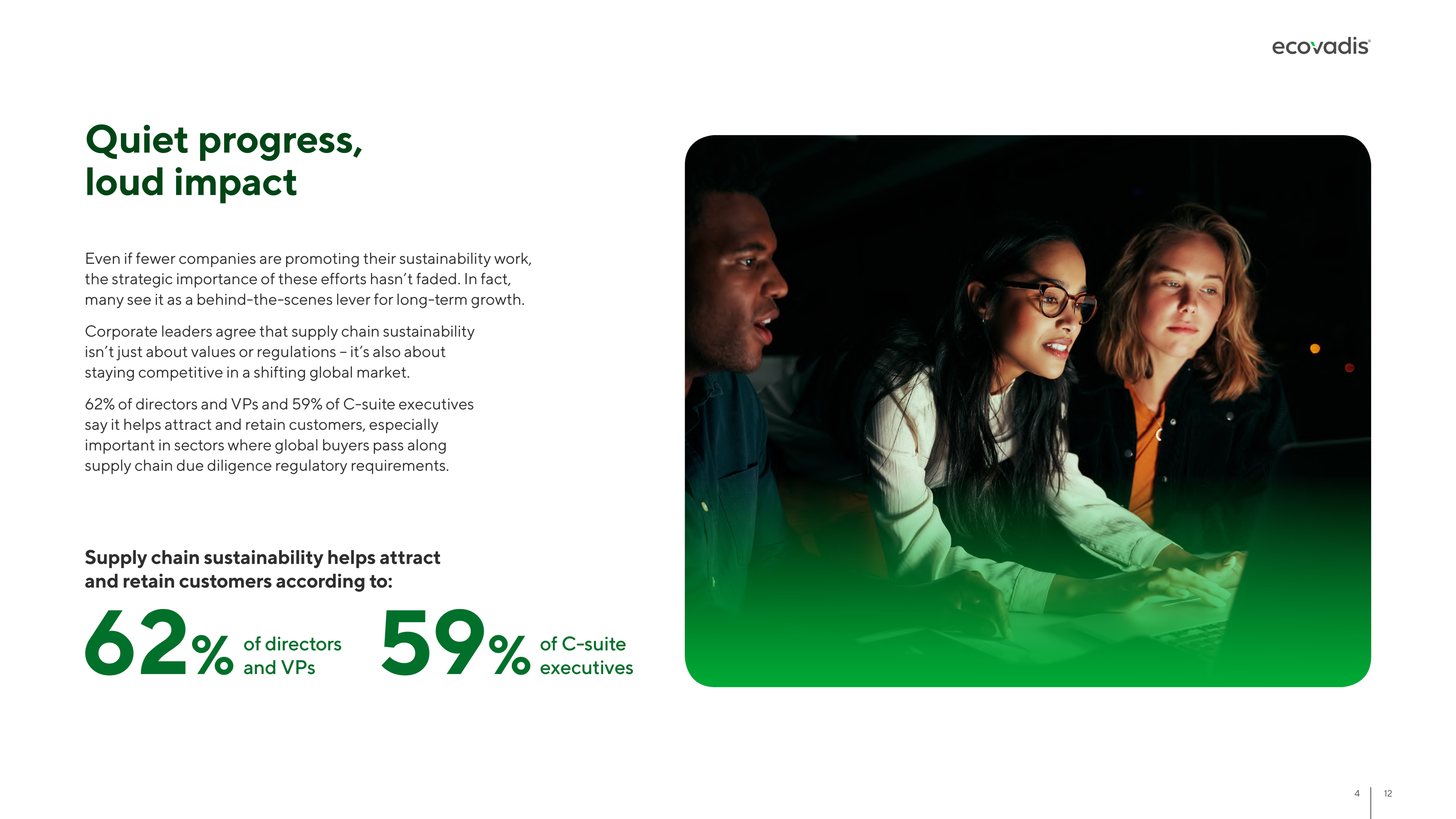
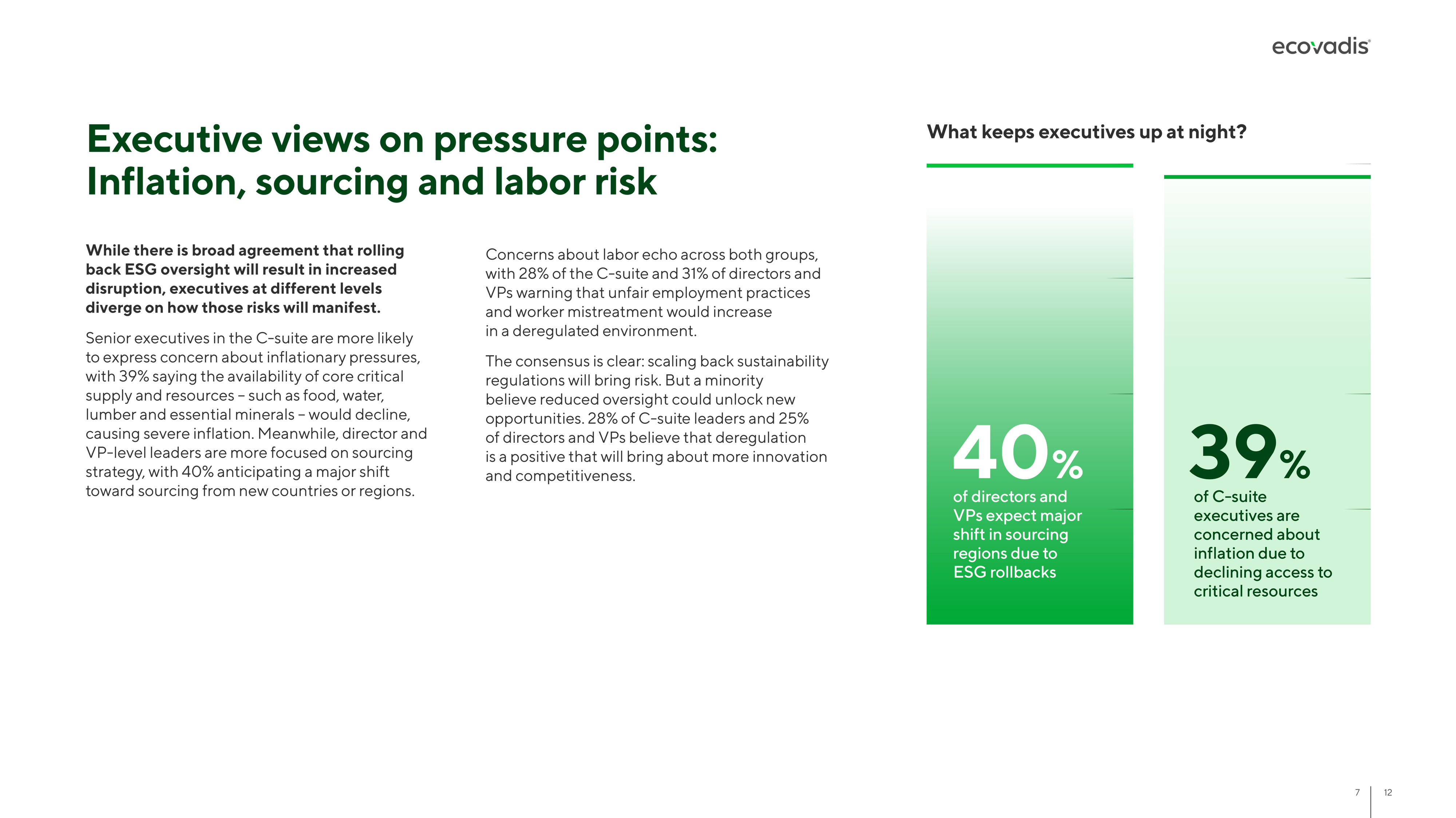
I designed the report following EcoVadis' established brand standards, focusing on elevating the graphics and data visualization throughout. Large-scale statistics anchor each page, paired with clean, custom charts and generous white space to keep complex findings easy to scan. Alternating light and dark spreads create visual rhythm, while consistent iconography and callout styling guide readers from data point to insight, resulting in a polished, boardroom-ready report.



Digestive Cancers Europe
Annual report design
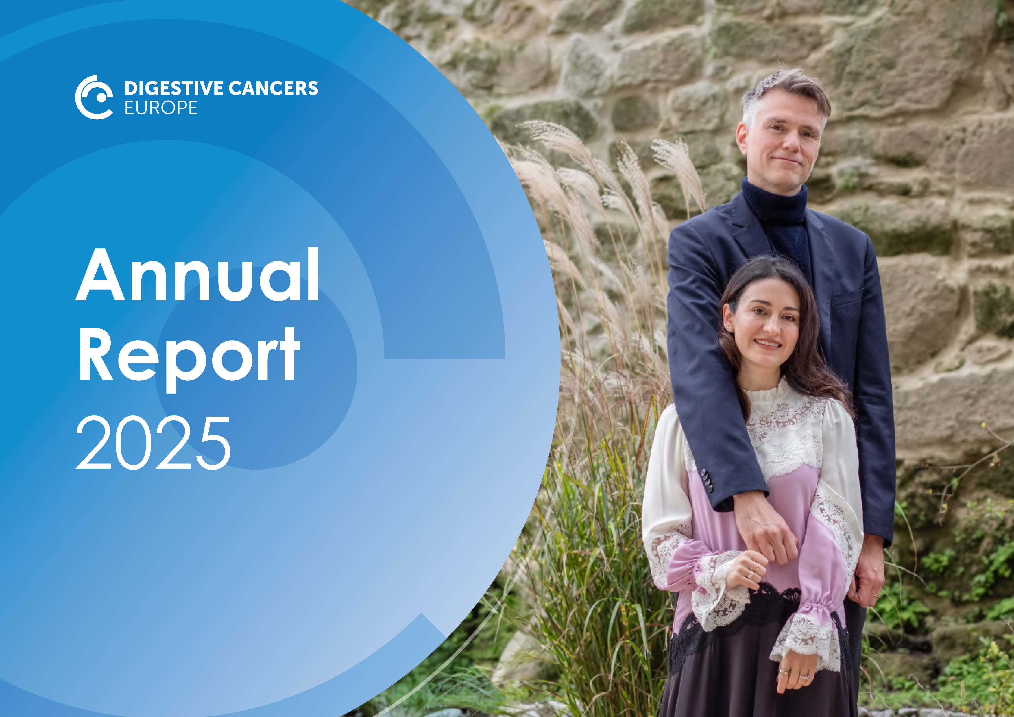
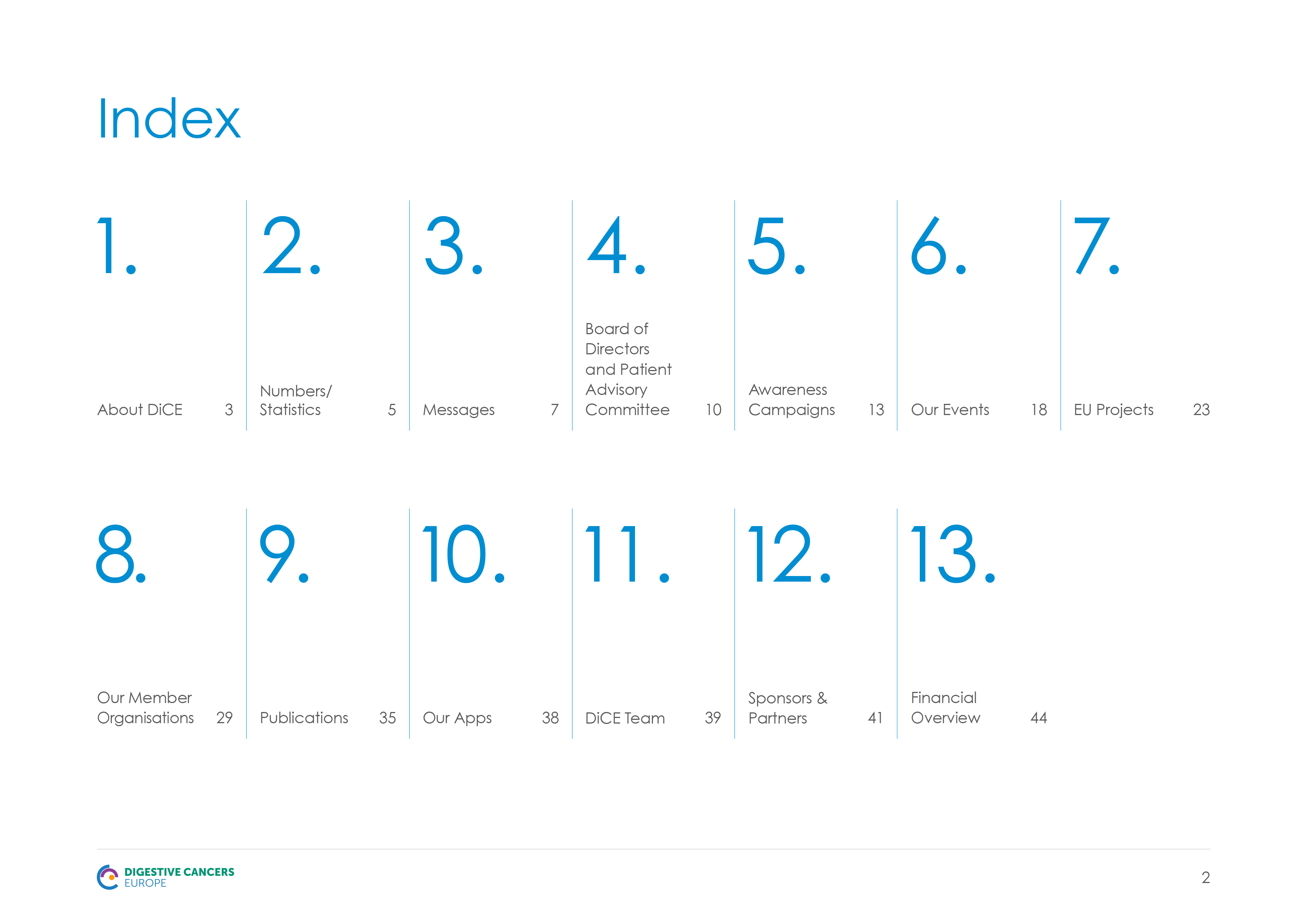
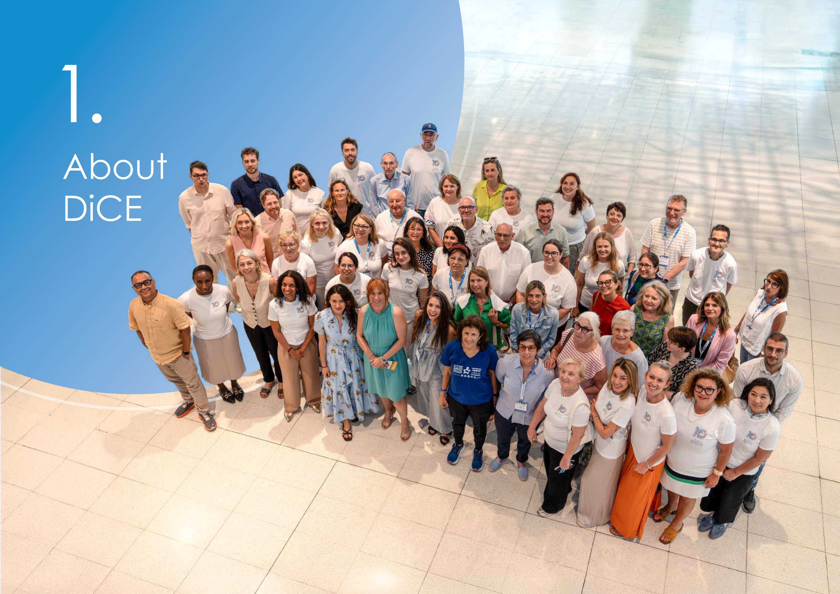
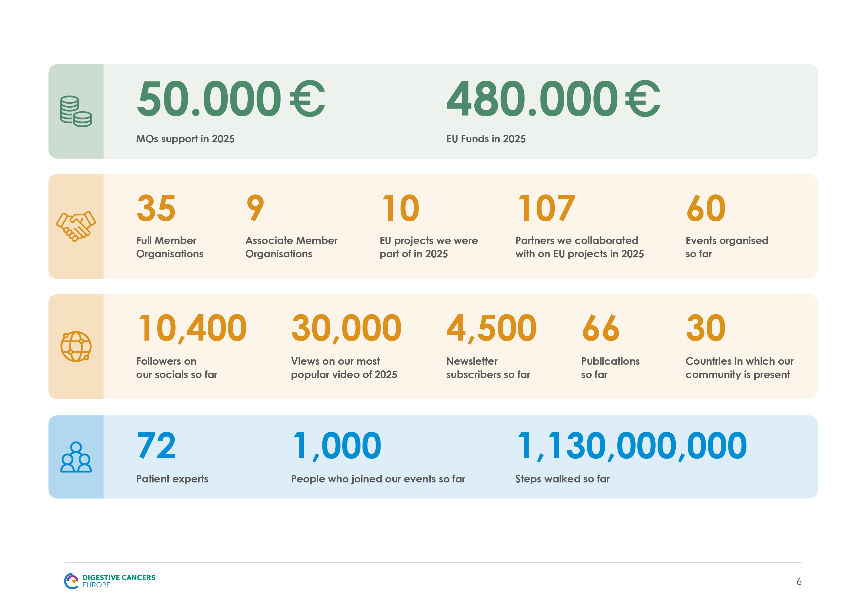
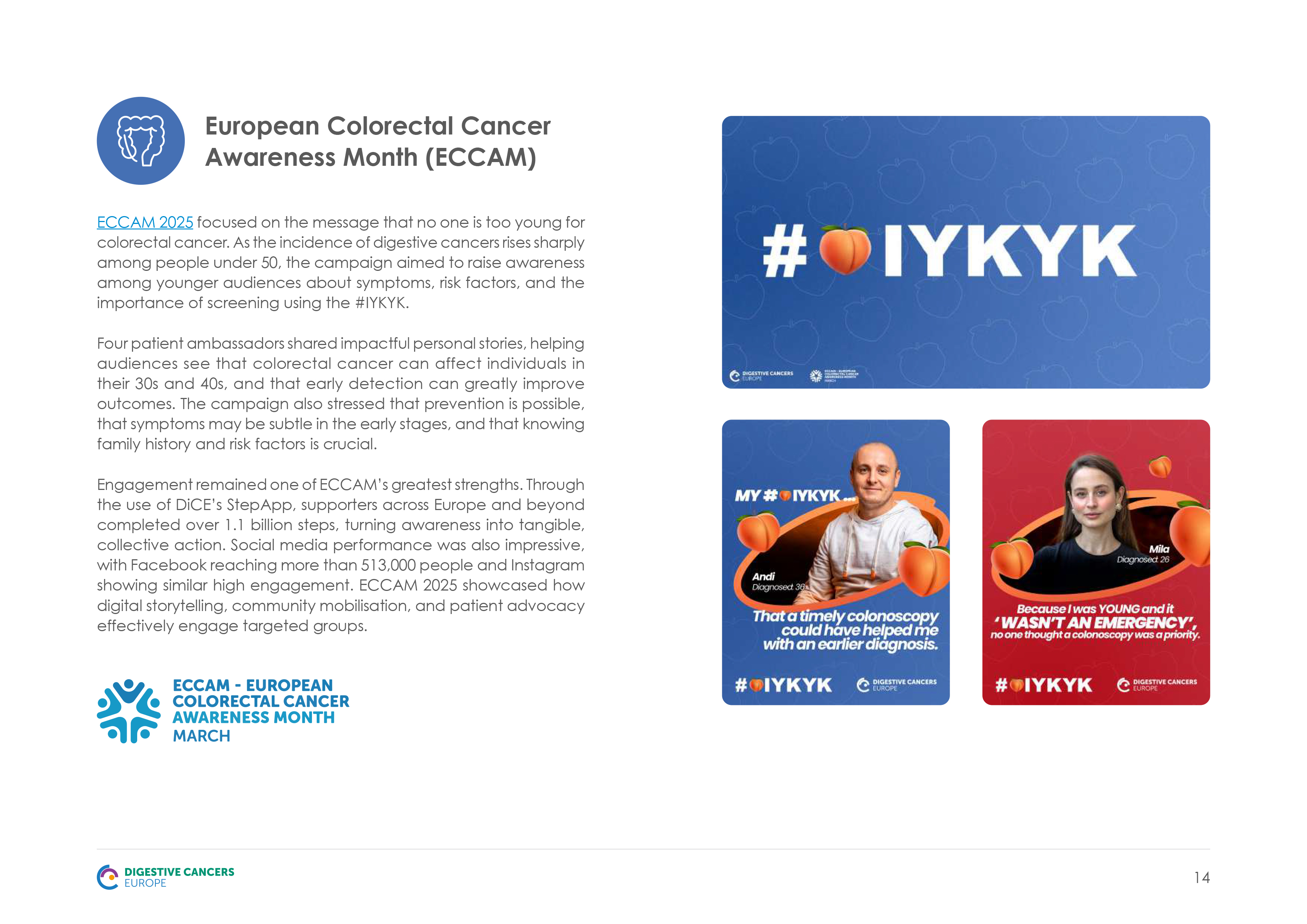
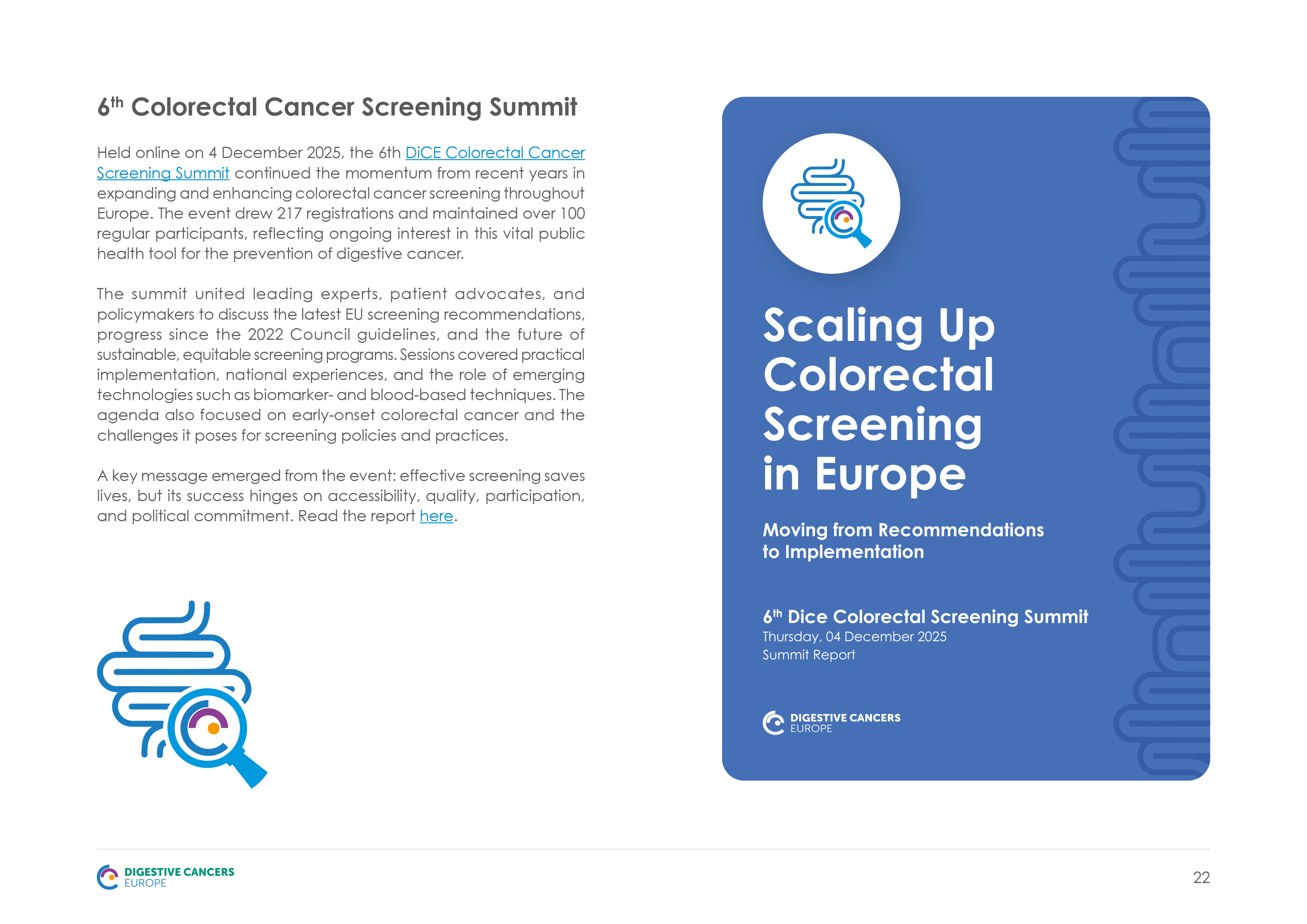
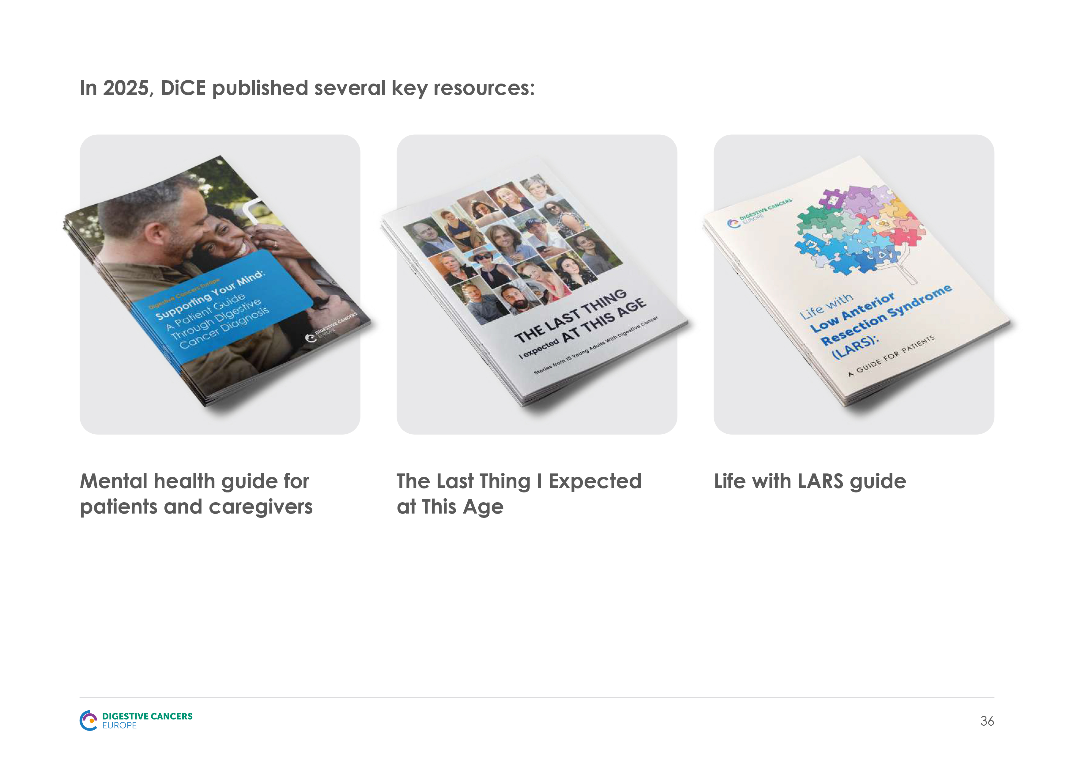
Digestive Cancers Europe (DiCE) is a European non-profit uniting patient organisations and advocates dedicated to improving survival and quality of life for those affected by digestive cancers. The 2025 Annual Report captures a year built around the “Year of the Patient,” covering awareness campaigns, EU-funded research, member highlights, and key statistics, including 1.1 billion steps walked through DiCE’s StepApp and 35+ Member Organisations across Europe.
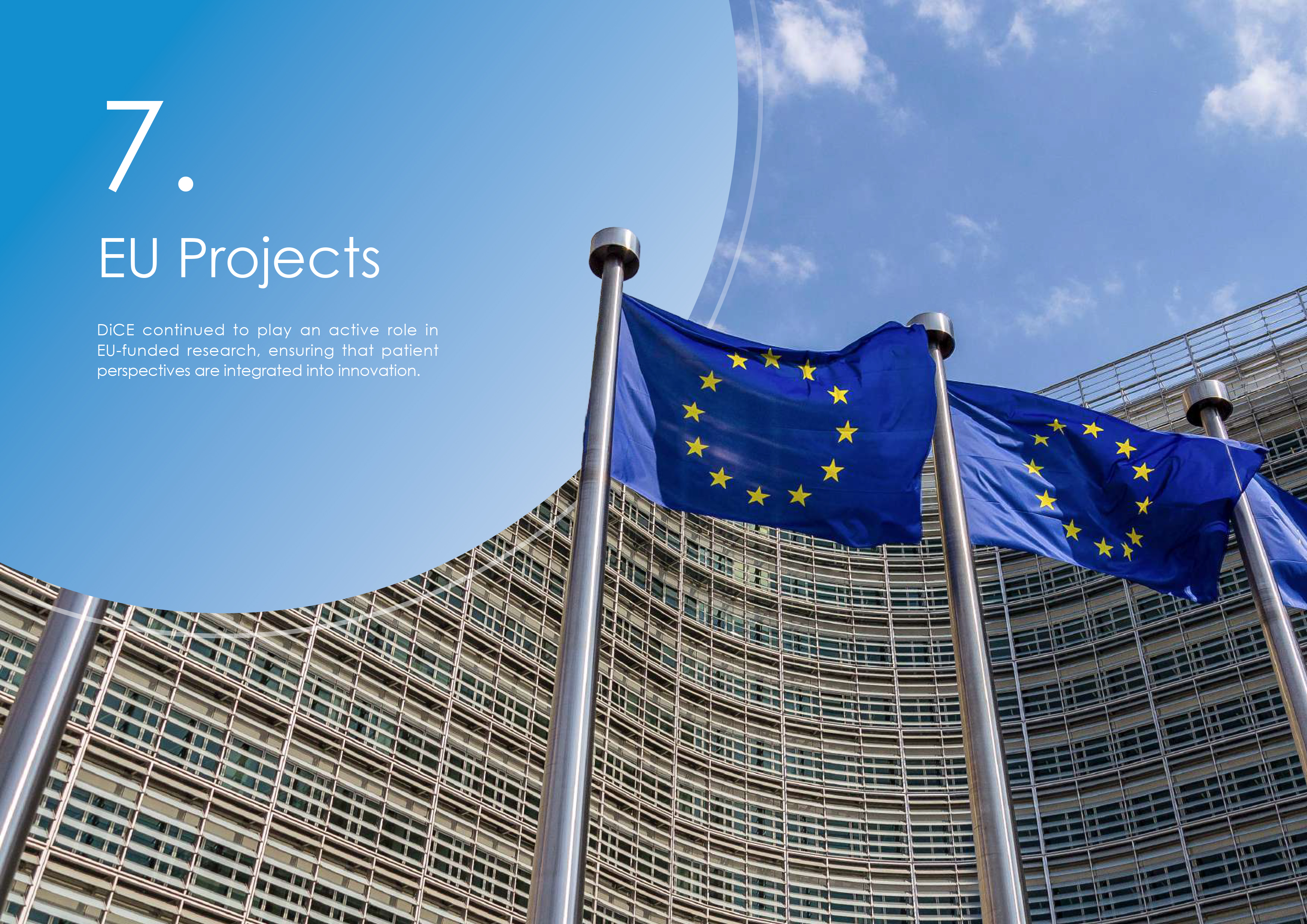
I designed the report following DiCE’s brand standards, built around a calming blue palette and circular graphics echoing the organisation’s logo. Each chapter opens with a full-bleed photo and bold numbered divider, creating visual rhythm across 45 pages. Clean data visualizations turn dense statistics into scannable highlights, while a consistent grid for member spotlights, team profiles, and partner logos keeps the content organized and easy to navigate.

European Blood Alliance
Annual report design
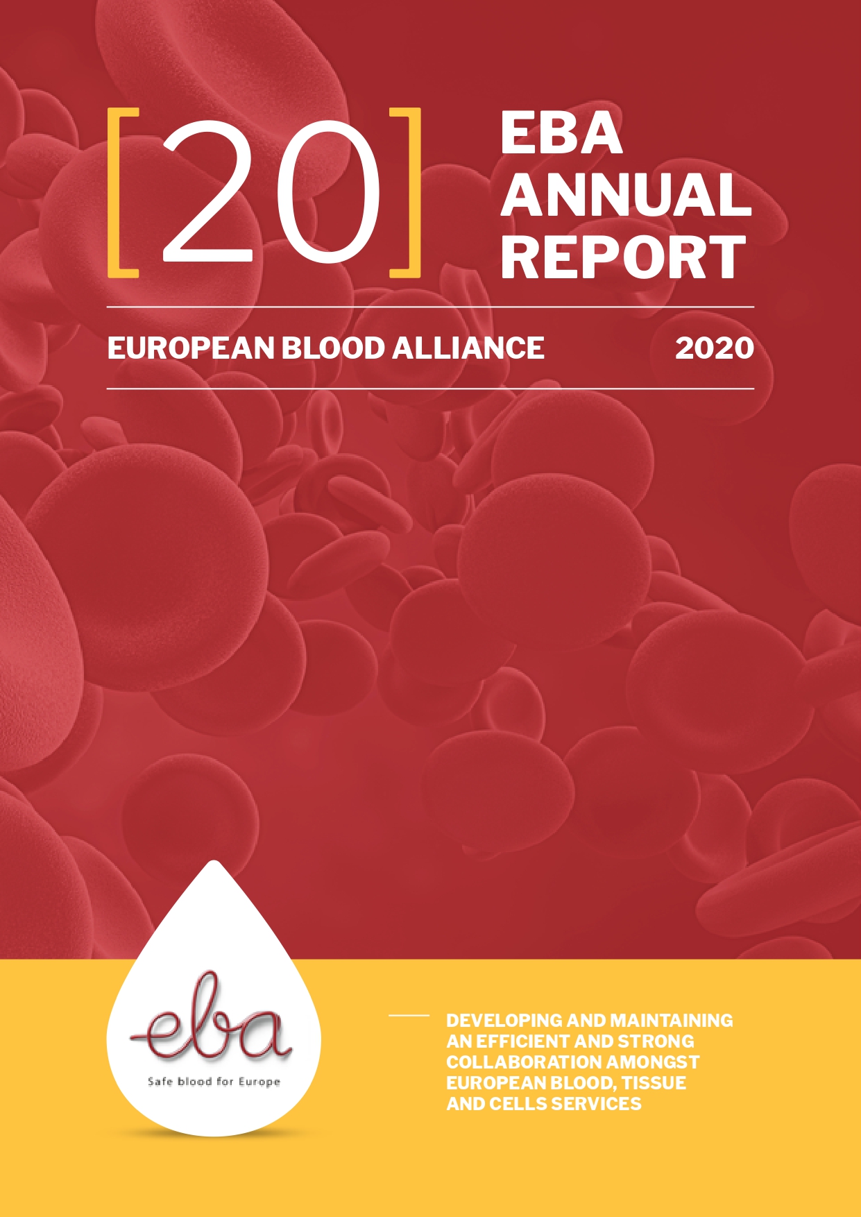
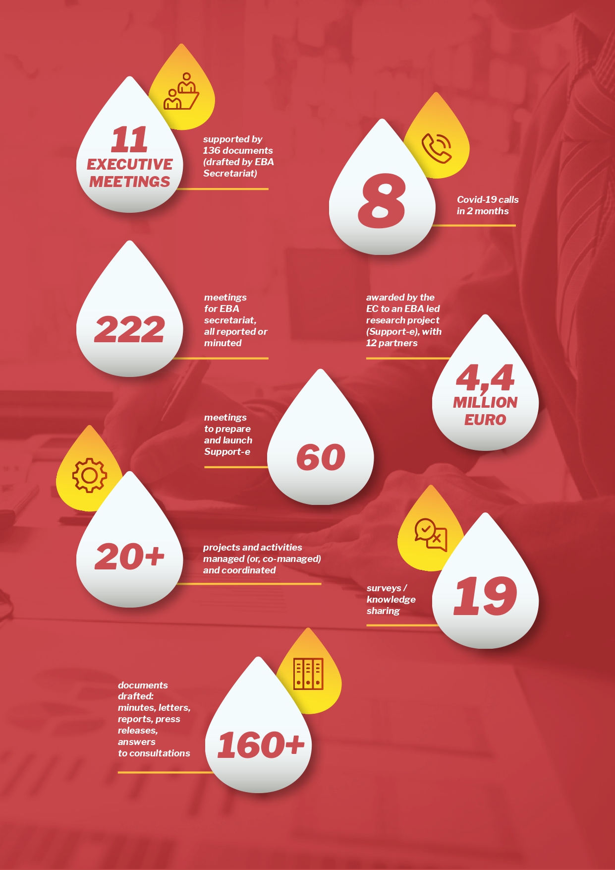
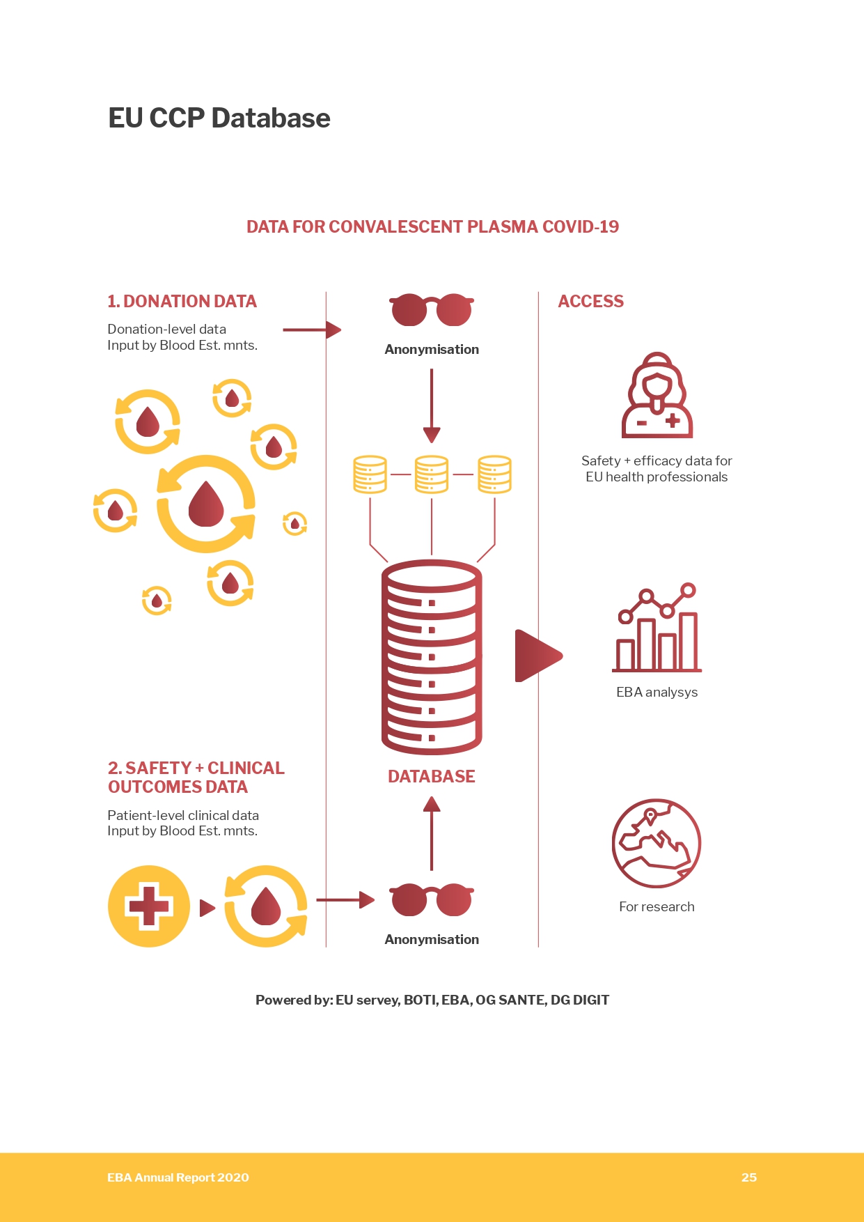
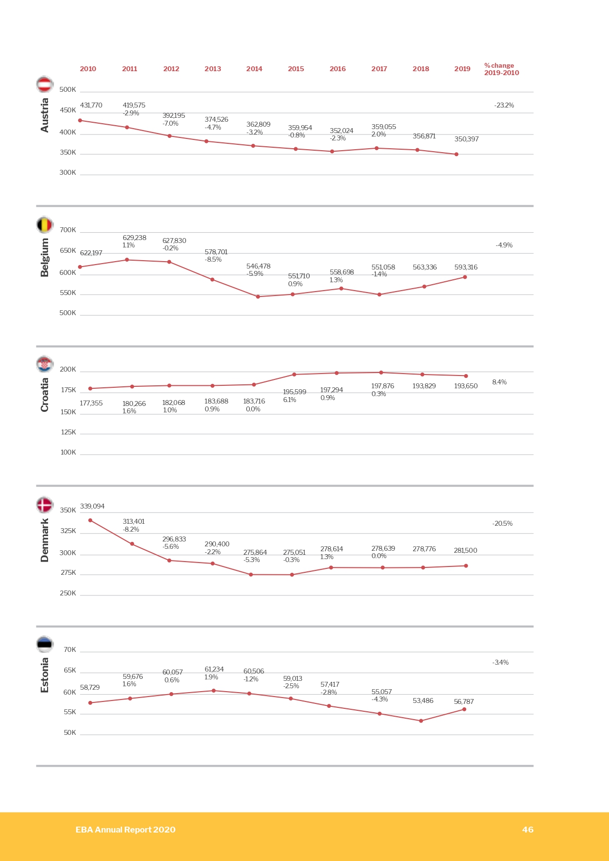
The European Blood Alliance (EBA) is a non-profit association of not-for-profit blood establishments across Europe, dedicated to safeguarding donor health, patient care, and the blood supply. The 2020 Annual Report reflects a year shaped by the COVID-19 pandemic, covering donor safety measures, the EU-funded Support-E convalescent plasma project, research grants, and key statistics, including donation data from 25+ member countries and over 20 million annual donations tracked.
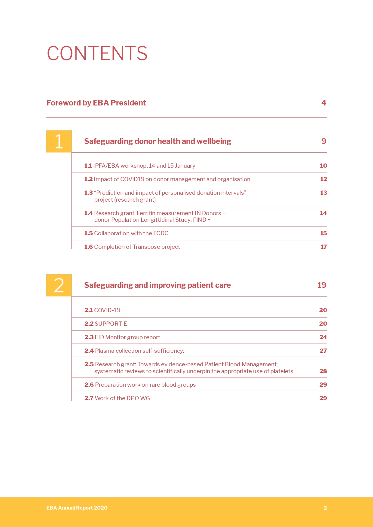
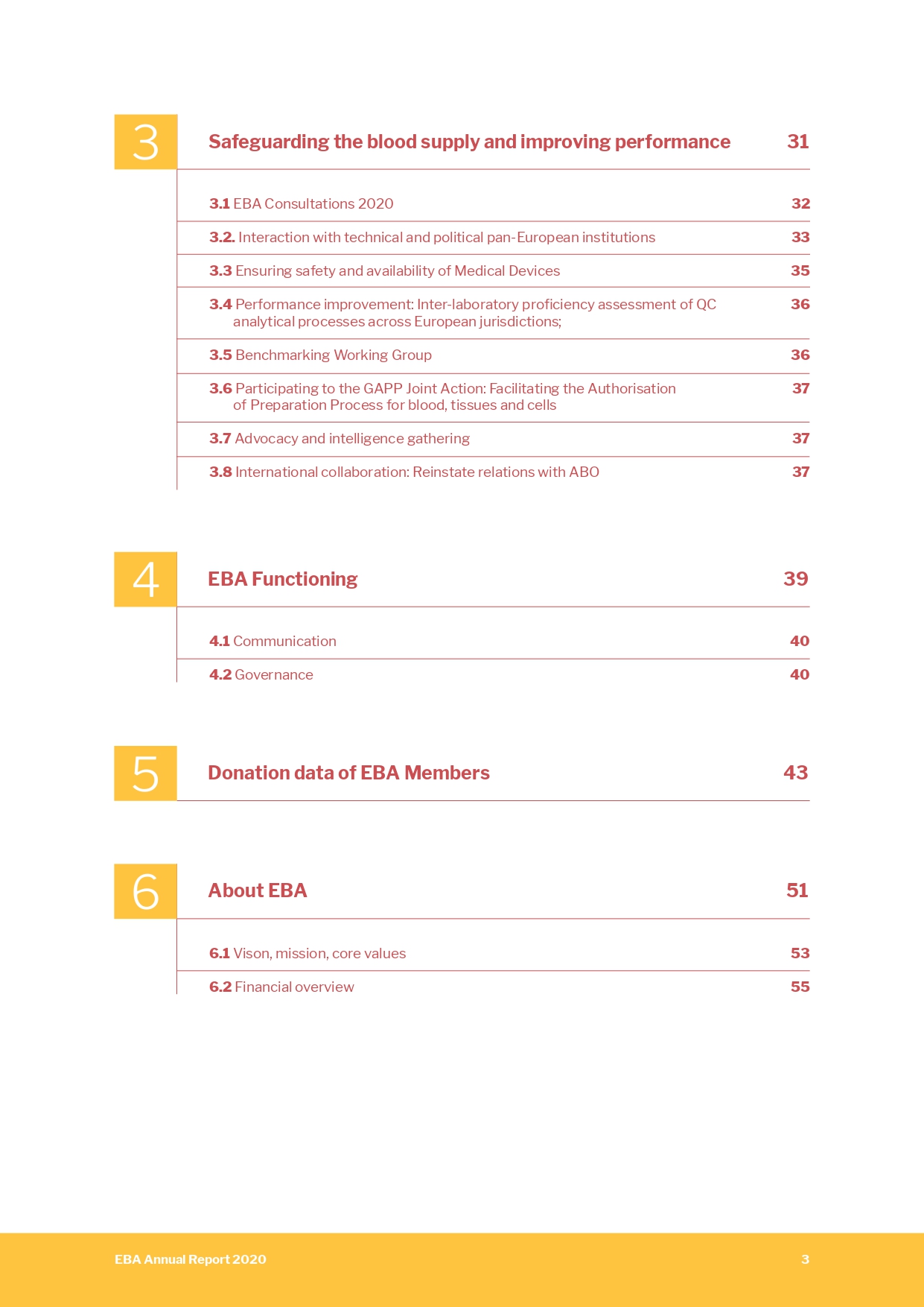
I designed the report following EBA's brand identity, built around a deep red and warm yellow palette echoing blood and plasma imagery, with a recurring teardrop motif drawn from the organisation's logo. Each chapter opens with a full-bleed photo and bold numbered divider, creating strong visual rhythm across 64 pages. Clean charts and icon-based infographics turn dense donation statistics into scannable highlights, while a consistent layout for working group updates, research summaries, and financial data keeps the content structured and easy to follow.