PORR - Home of Construction
Creative direction - advertising campaign designs
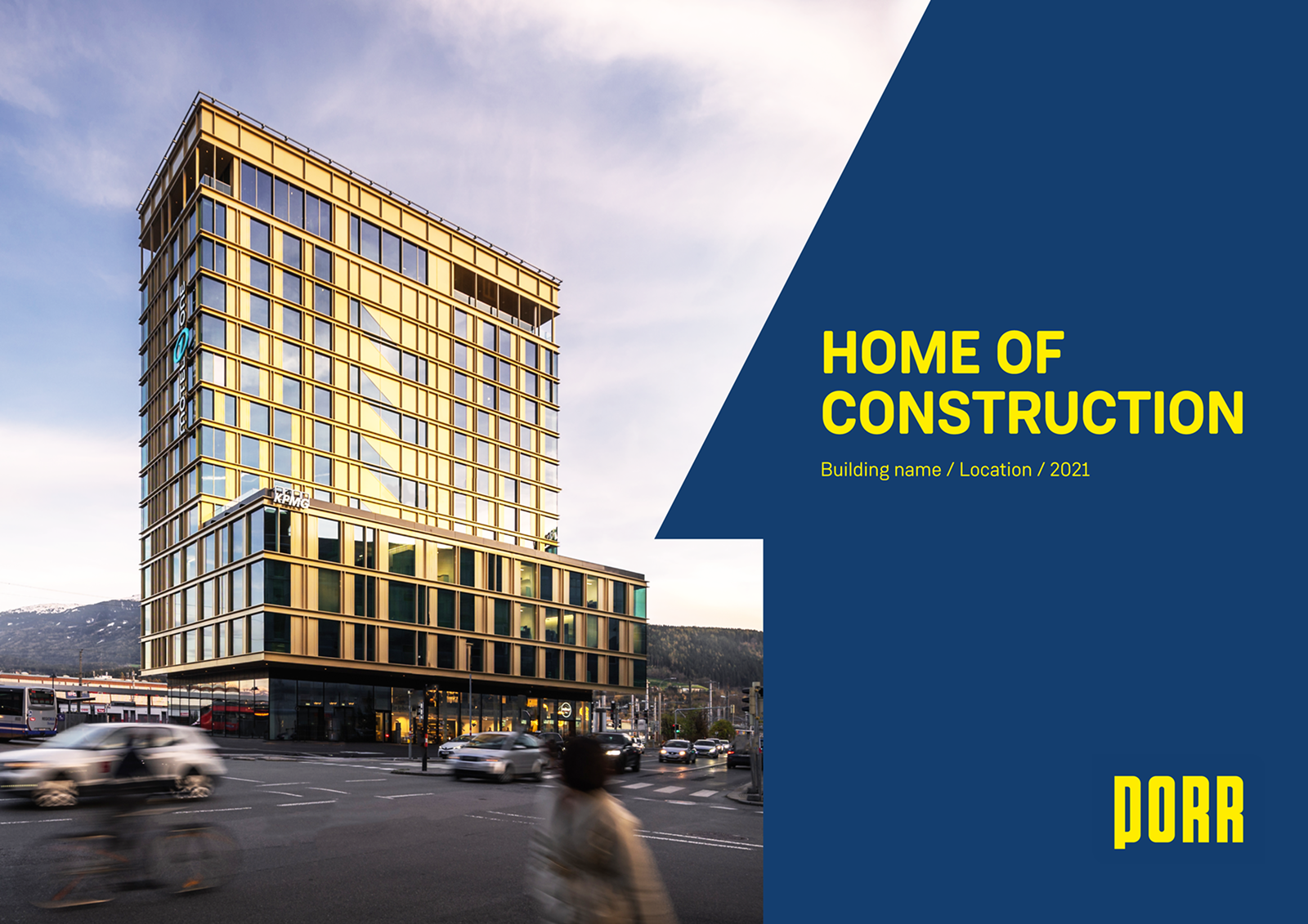
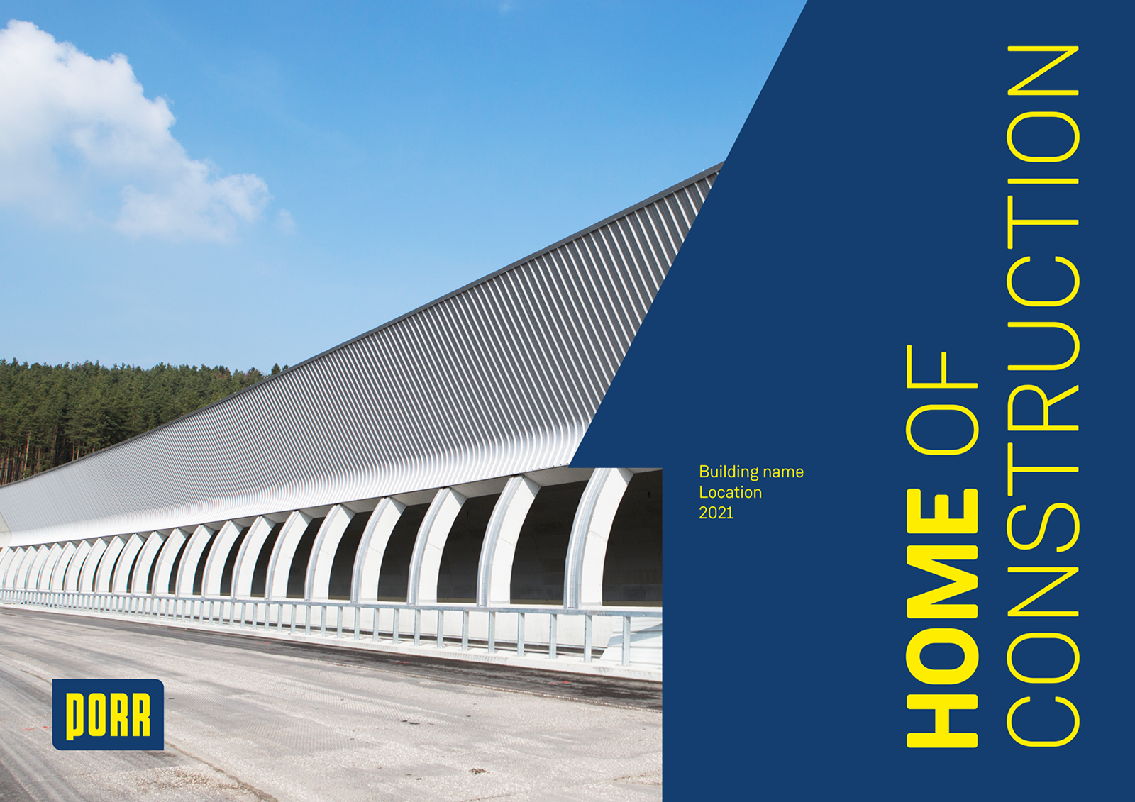
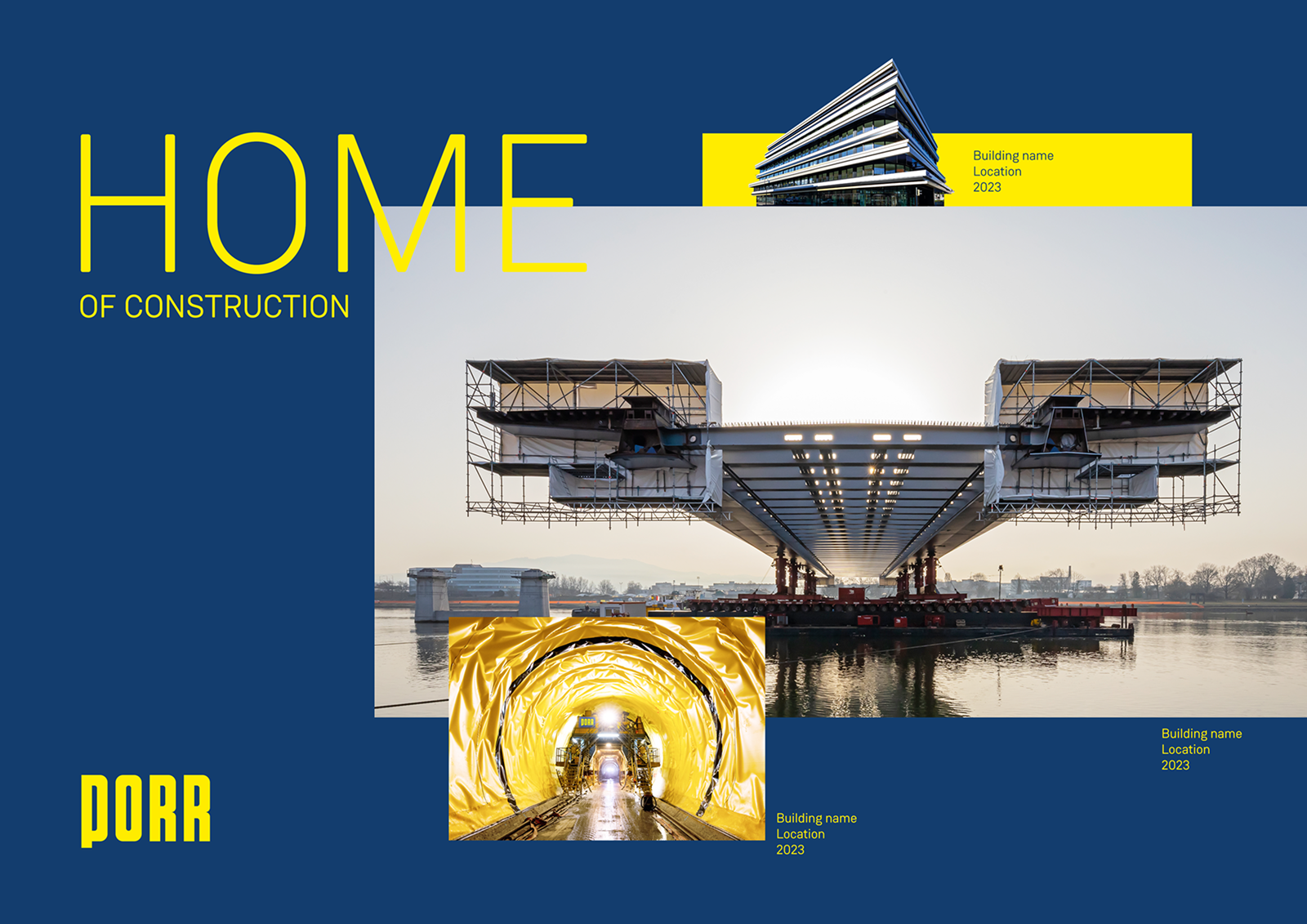
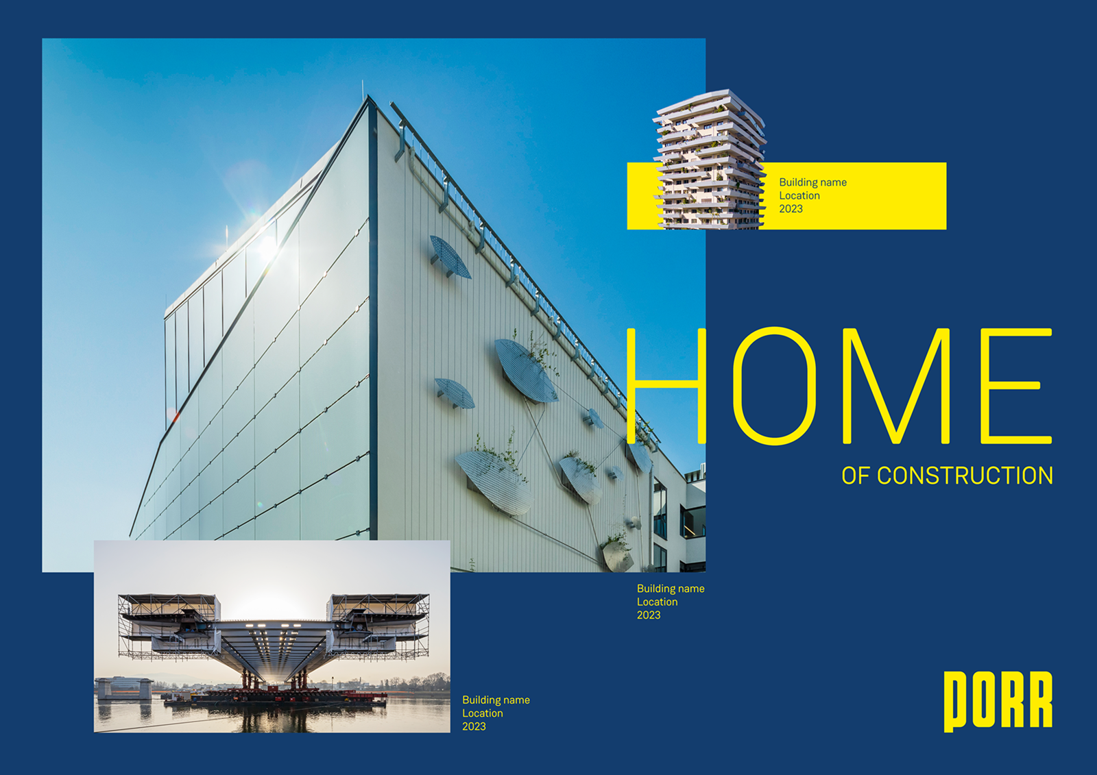
PORR is one of Europe’s leading construction companies, delivering large-scale infrastructure, commercial, and civil engineering projects across the continent. This “Home of Construction” campaign set showcases the brand’s project portfolio through bold title slides and gallery-style layouts, built for use in presentations, project sheets, and marketing collateral.
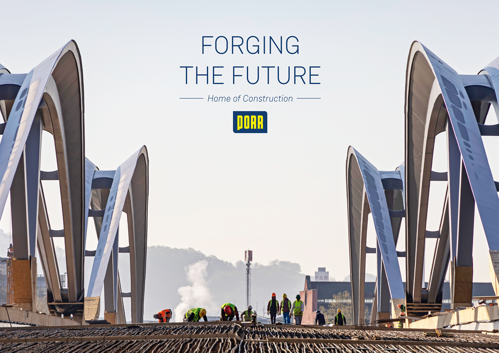
I designed the templates around PORR’s signature navy and yellow brand palette, using an angled diagonal motif as a recurring graphic device that ties each layout together. Full-bleed construction photography, from completed towers to active bridge and tunnel sites, anchors each slide, while bold condensed typography and consistent caption placement keep building names, locations, and dates easy to scan across the modular, reusable system.
Creative direction 1
- Prominent building image
- Important flat colour panel
- Home / #1 shape
- Split format
- Modern & simple style
Creative direction 2
- Powerful slogan proposals
- Strong emotion
- Classic layout
- Minimalist & mature style
- Image background
- Prominent structure
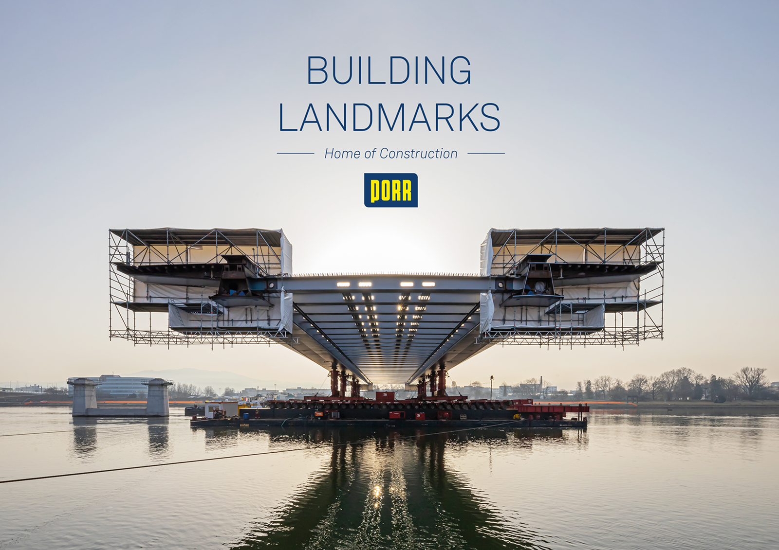
Creative direction 3
- Bold title-led campaign system
- Architectural imagery
- PORR navy and yellow brand palette
- Flexible reusable layouts
EcoVadis
Ads campaign design
EcoVadis is a global business sustainability ratings platform that helps companies assess and improve the environmental, social, and ethical performance of their supply chains. This set of ad creatives promotes two free lead-generation tools: carbon risk mapping and supplier risk mapping for modern slavery.
I designed the ads around a consistent square format with bold, high-contrast headlines set against striking editorial photography, from aerial shipping ports to close-up agricultural labor shots. The signature EcoVadis green anchors the logo and CTA across every variation, keeping the repeatable template instantly recognizable across campaign themes.






eHealth Group
Advertising materials / visual designs
Creative direction 1
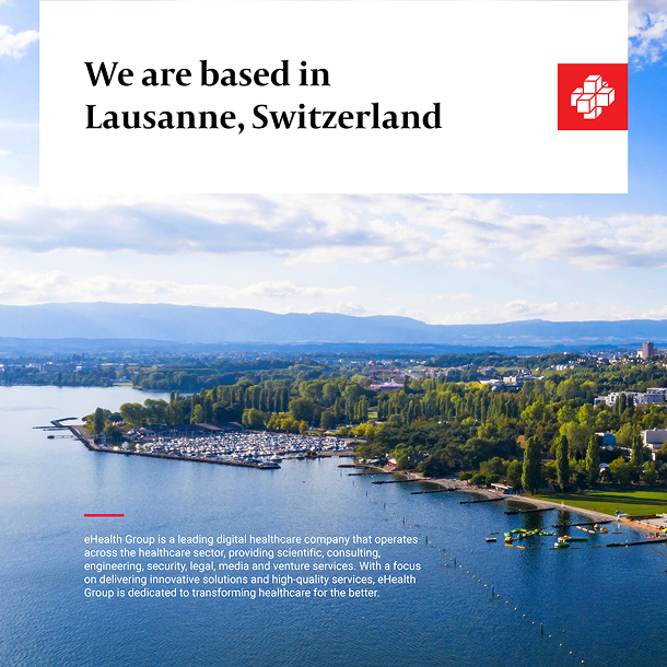
The creative direction for eHealth Group’s visual identity draws inspiration from Lausanne’s modernist architecture, reflecting the precision and clarity inherent in Swiss design. This approach emphasizes structured layouts and clean typography, embodying the brand’s commitment to innovation and trustworthiness in digital healthcare.
By integrating elements of classic Swissness, the design conveys a sense of reliability and professionalism, resonating with business professionals and stakeholders. The visual language combines minimalist aesthetics with strategic use of space and color, highlighting eHealth Group’s role at the forefront of healthcare technology solutions.



Creative direction 2
The creative direction for eHealth Group’s visual identity integrates a corporate medical aesthetic with dynamic graphic overlays, featuring doctors and scientists alongside advanced devices to highlight innovation in digital healthcare.
This visual approach underscores the company's commitment to pushing boundaries, reflecting a forward-thinking ethos that positions eHealth Group at the forefront of technological advancements in the medical industry.




Creative direction 3
The creative direction blends abstract 3D-rendered backgrounds with elements of blockchain and AI technology, creating a futuristic visual language that signals innovation and digital intelligence.
This approach reflects eHealth Group’s vision of leading-edge healthcare solutions, where data security and artificial intelligence converge to shape a smarter, more connected medical future.




Anekdot Boutique
Creative direction - advertising key visuals & social media
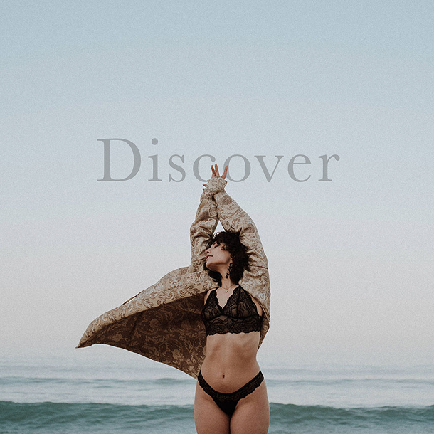
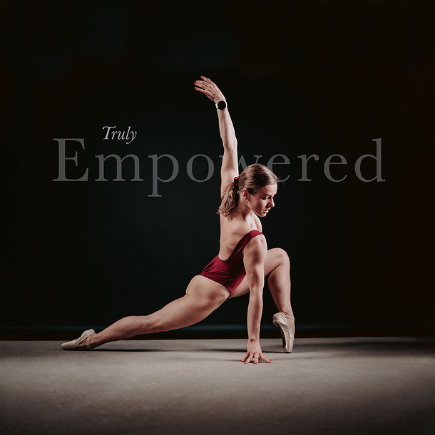
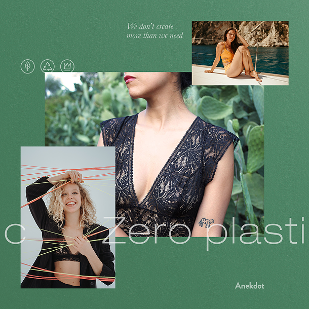
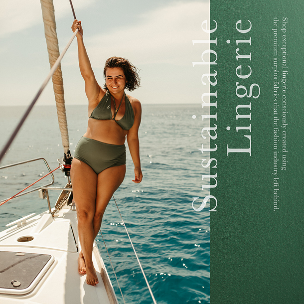
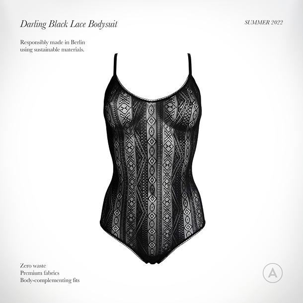
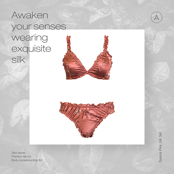
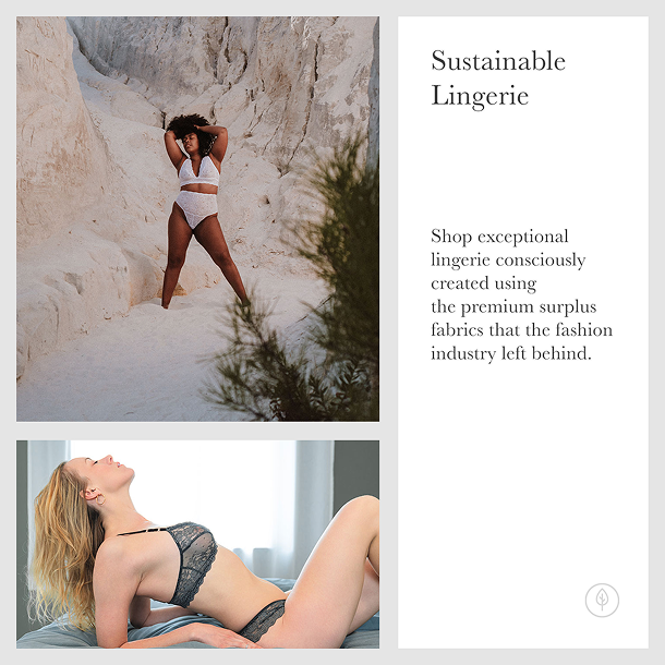
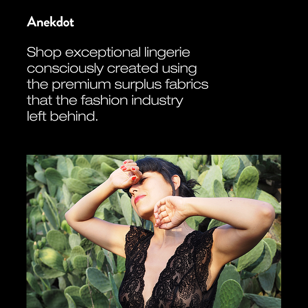
Anekdot Boutique is a sustainable lingerie and swimwear brand based in Germany, known for its strong commitment to conscious fashion, refined craftsmanship, and timeless, eco-friendly design principles that celebrate individuality, quality, and environmental responsibility.
The key visuals were developed through diverse art directions to express the brand’s multifaceted identity, from poetic one-word headlines and collage-style storytelling to elegant product showcases and freeform line art. The use of deep green tones, resulting in a refined collection of campaign designs with subtle exclusivity and a luxurious feel.
Sportslots
Advertising materials / visual designs
Creative direction 1
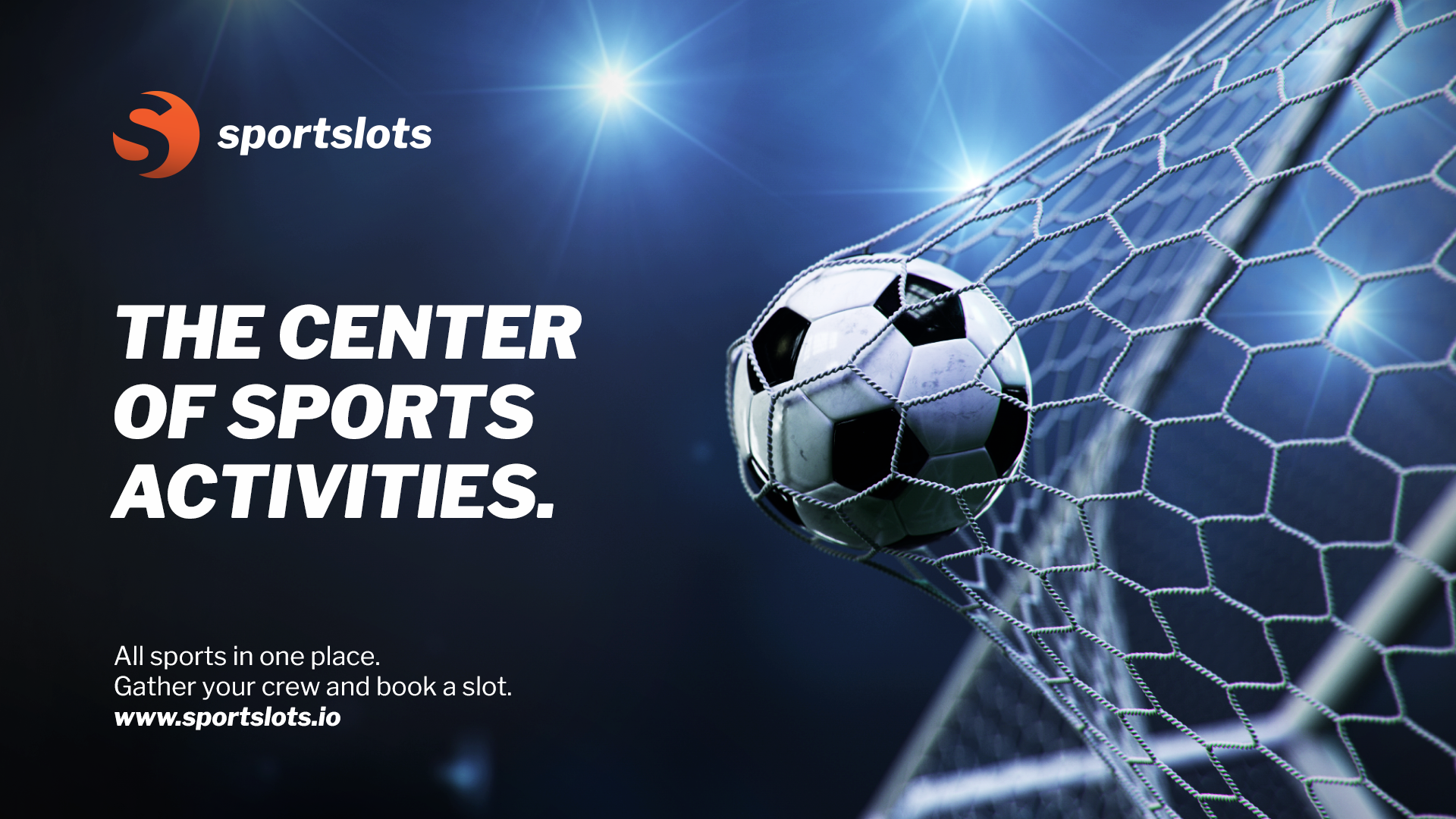
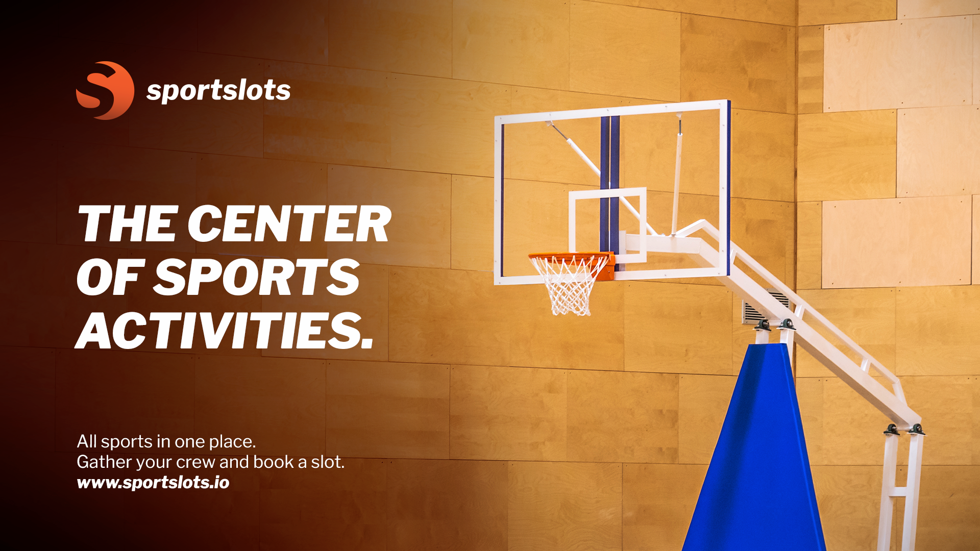
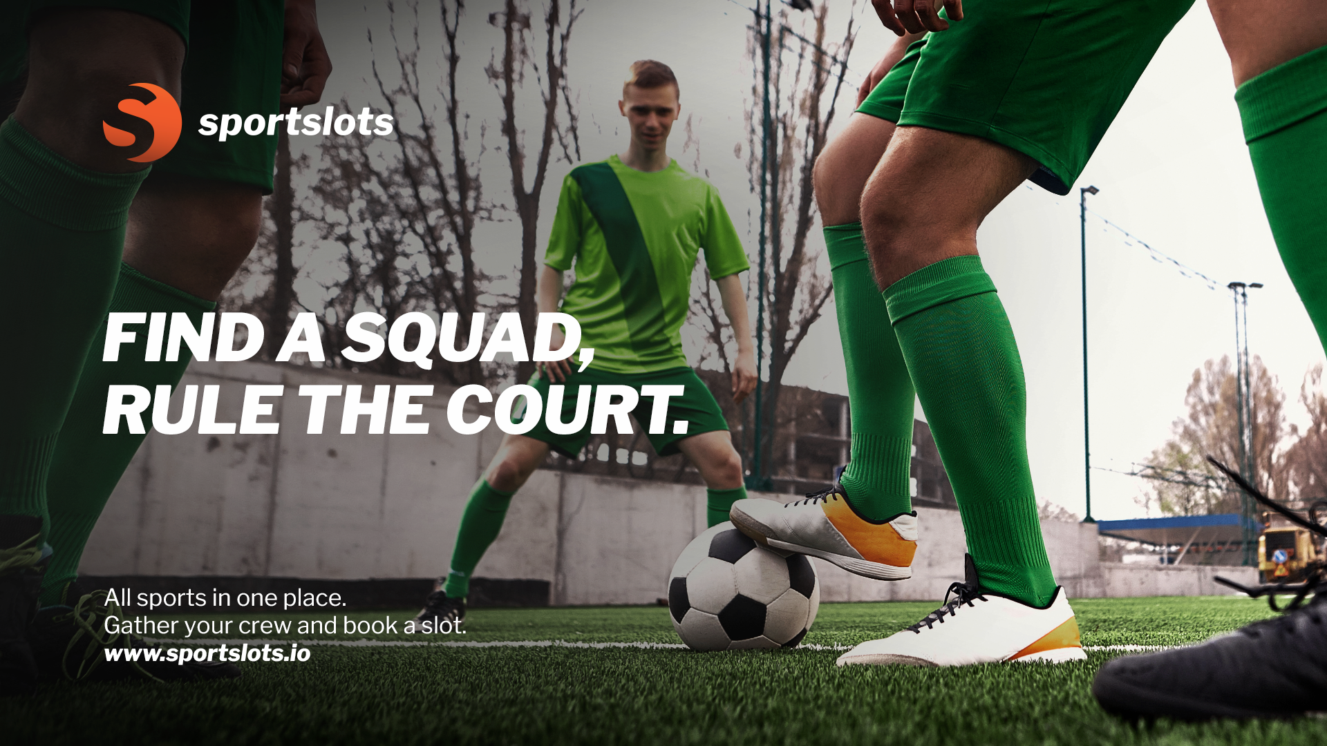
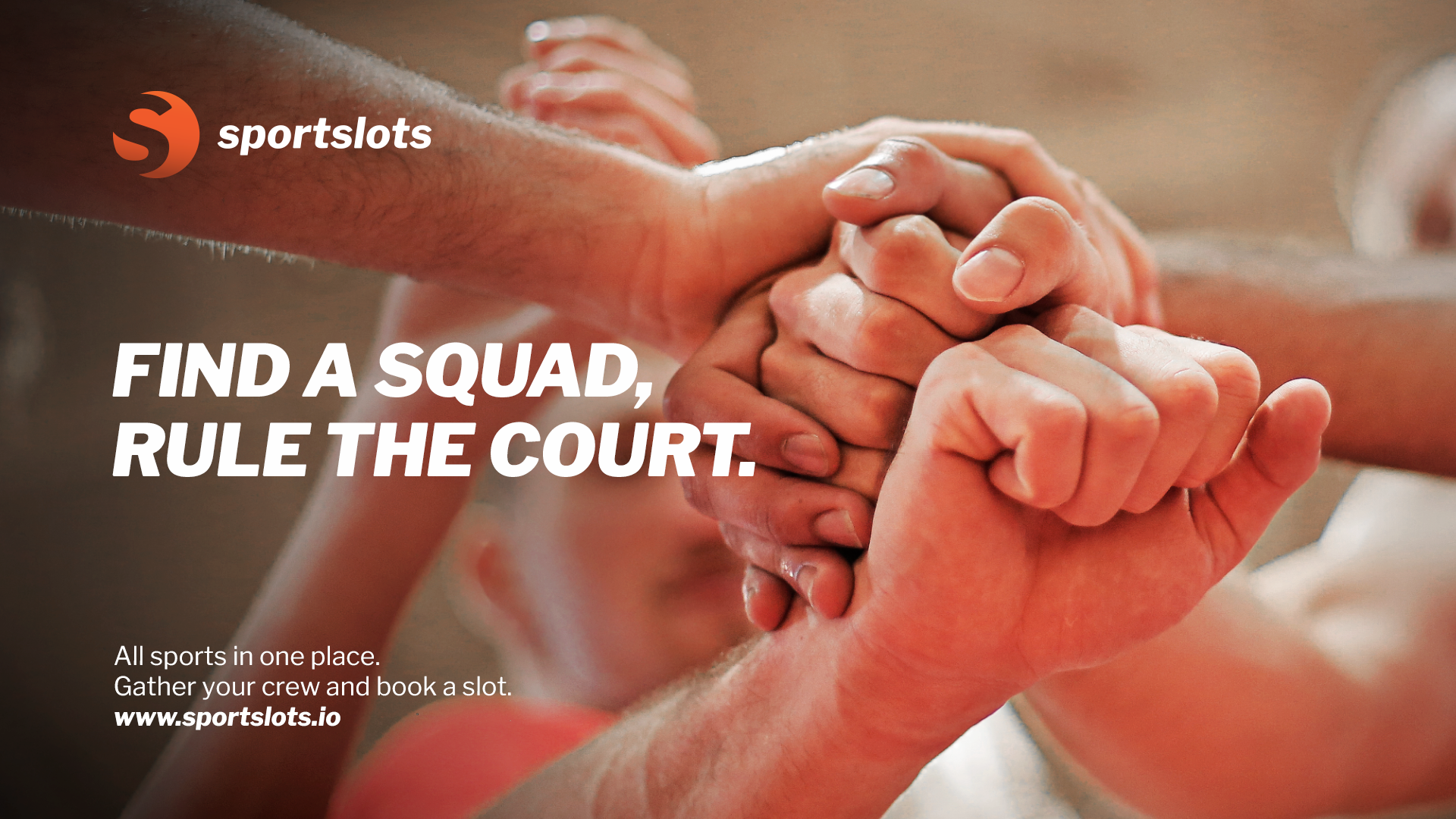
Realistic, sports-inspired visuals that capture the essence of teamwork, sportsmanship, and the collective spirit of the game. Engaging call-to-action prompts encourage players to assemble their team or jump into a pre-scheduled match, making every game more accessible and exciting.

Creative direction 2
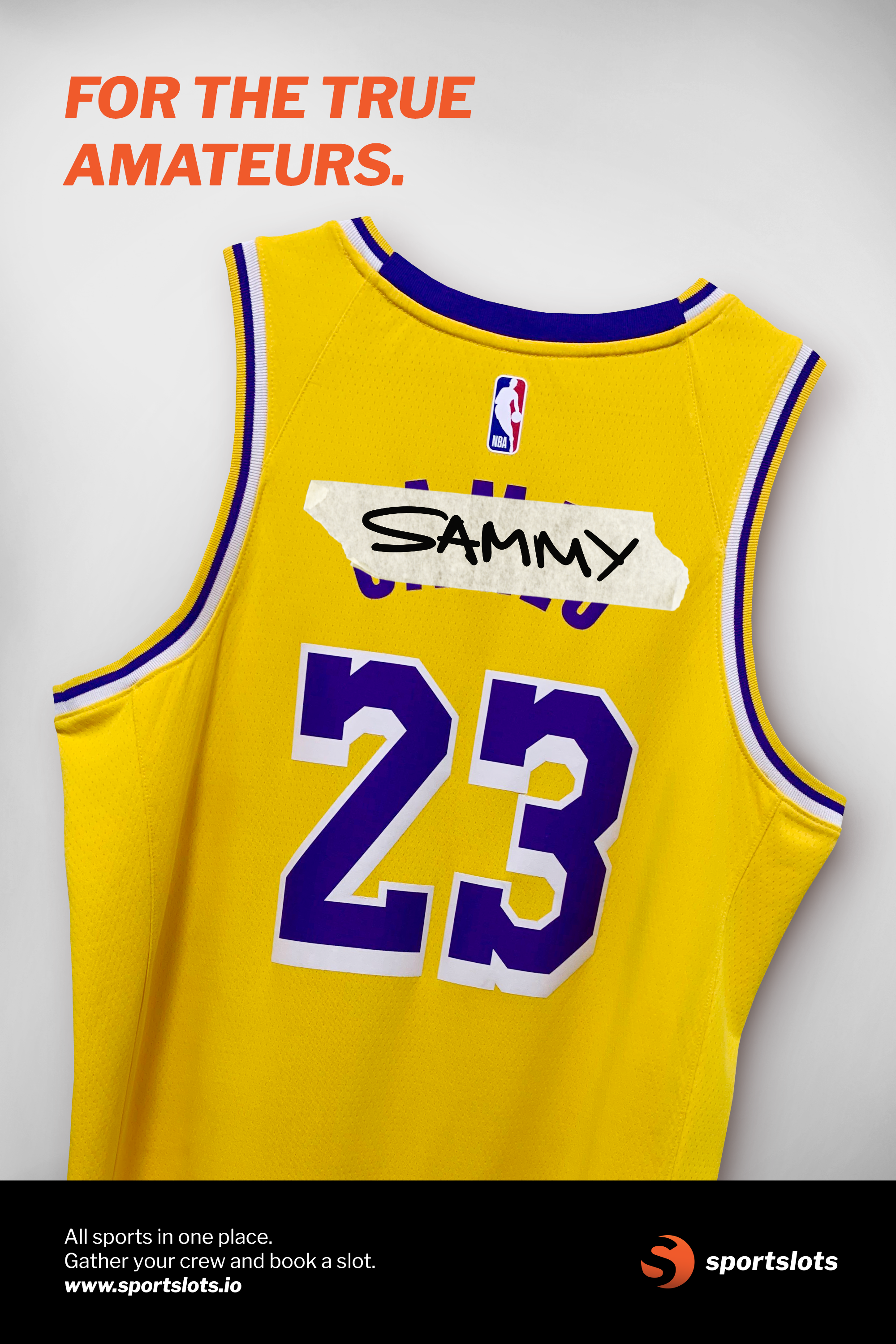
Photo montage featuring iconic sports jerseys, where the names of legendary athletes are replaced with those of recreational players. This creative approach places amateur athletes in the spotlight, letting them experience the thrill of being in the shoes of a sports icon.