Origin of Future

Visual identity and brand assets

Origin of Future is a marketing agency that helps businesses grow and succeed. With a team of experienced marketing professionals who know what it takes to build a successful online business, OOF is helping small and medium size companies to reach their goals.
The identity design features and expanded list of brand assets and guidellines. Logo design is based on a scientific approach that uses brand initials in form of a mathematical formula where the initials ‘O’ and ‘F’ are positioned to indicate the squering concept. This idea is best described as ‘Origin PER Future’.

Logo design

Slogans

Social media

Prison achievement award

Visual identity and brand assets

The ‘Prison Achievement Award’ honors prisons from throughout Europe that demonstrate innovation and overcome operational issues. This award brings more awareness about how other prisons come up with solutions which will unite and bring the network closer together.
The logo designs shows a handshake between a prison officer and a prisoner. This symboliises the unity and forward thinking in the European Penitentiary systems. The graphic symbol is in form of a badge / medal with a serif typography to portray a traditional style.

Logo design

Layout design template

Landing page design

Chalkline sports

Online games logo designs

The Daily Challenge logos feature a 3D, illustrative style inspired by gaming culture—bold, vibrant, and engaging, designed to reflect the excitement of daily sports picks and capture the competitive spirit of Chalkline's interactive challenges.
The Quick Picks logos emphasize motion, speed, and high energy to match the fast-paced nature of the game. With dynamic shapes and bold design cues, they convey the thrill of quick decision-making in the world of real-time sports betting.

Daily challenge logo family

Quick picks logo  family

Mogren basketball club

Logo design and apparel

Mogren is a Montenegrin basketball club from the city of Budva. It was founded in 1975. The club wanted to redesign their logo with a modern and strong aesthetic that will portray the city silhouette.
The logo is in form of a crest / emblem with the historical city monuments added inside an emblem hich features the top of the Old Town tower with five bricks symbolising the fivee players in a basketball team. The design blends modern sans serif typography with thee traditional and historical elements.

Logo design

Jersey close up preview

Apparel design

Innovation in Prisons Infrastructure Conference

Logo and landing page design

The logo for the Innovative Prisons Infrastructure Conference (IPIC) embodies a clean, minimalist aesthetic that highlights architectural elements. Its straightforward lines and uncluttered form convey the conference's focus on modern, sustainable prison design.
By emphasizing simplicity and clarity, the logo effectively communicates the event's dedication to innovative infrastructure solutions in corrections. The design's architectural focus aligns seamlessly with IPIC's mission to advance prison planning and design.​

Negative space logos

Various designs utilizing the empty space

EPTA


European Penitentiary Training Academies logo design features a key symbol in the negative space

Cake from the heart


Cake from the heart
Cake shop that makes cakes and sweets directly from the heart, so I added a cake in front and added some candles as well :)

Athletic’s gym


The initial letter ‘A’ with an arm flexing the bicep in the negative space.

Corporate logos

Various designs for corporative businesses

Dina card - People’s Bank of Serbia

Peoples’ Bank of Serbia has the national payment system in RSD currency and they issue cards to their users.
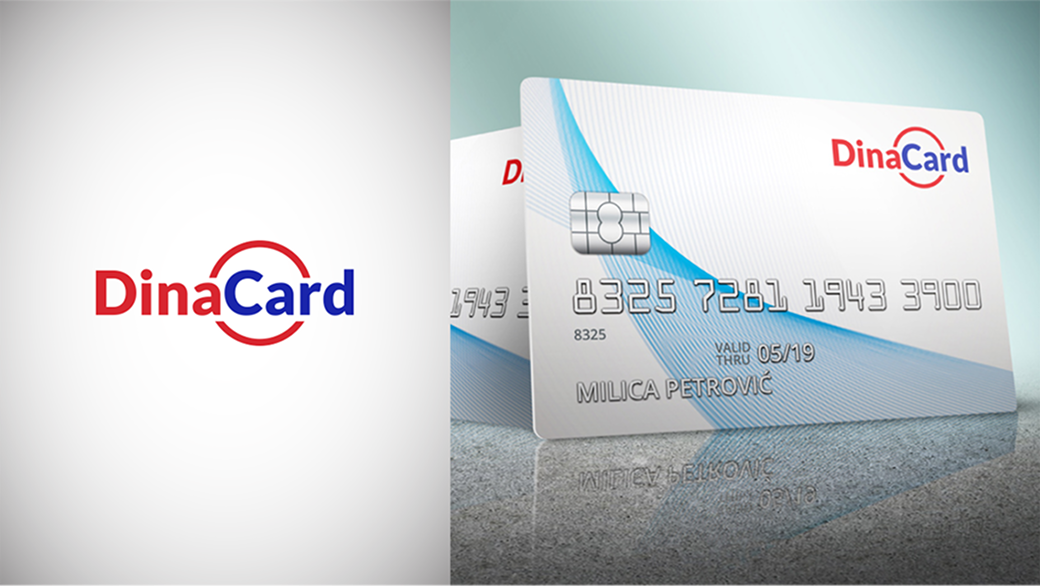
The goal was to create a link and emphasize the Serbian Dinar currency - Dina is linked to letter ‘R’ from the Card text, thus creating the word ‘Dinar’. The circle also acts as a form of a coin.

*First prize winner at the Peoples’ Bank of Serbia contest.

inField  Research

Combinig the motives of magnifying glasses in different heights to portray a graph rising (statistics). 
Flat line at the bottom creates a balance and acts as a field with loops being the trees.

Allianz consulting


German based consulting agency wanted to have a logo with a handshake symbol but not too obvious.
That is why I created an abstract handshake graphics with a corporate style.

Casino games

Illustrative 3D logo designs for online gambling

Casino Piraat


Dutch casino and online gambling website. Concrete paper fold with golden graphics. The client wanted a Pirates of the Carribean style logo.

Octopus Dice

Online slot game - Octopus Dice logo is made out of octopus tentacles illustration.

Treasures of Valhalla

Nordic inspired design with ornaments embedded into the typography.